SeniGo CoHab
Connects students who need somewhere to live with older adults who have a spare room — matched on how well they would live together, not on price.
About the project
What it is
SeniGo CoHab is an intergenerational home-sharing platform, designed and built for a pilot in Leiria. It puts two people with complementary needs in contact: a university student looking for affordable accommodation, and an older adult with a spare room at home. The older adult gets rent and company; the student pays less than the rental market would charge.
The platform treats the two sides as distinct roles from the very first screen. Choosing between "I'm a student" and "I have a room" is not a filter — it determines the questionnaire the person answers, the fields they fill in, what they see when browsing profiles, and which side of the agreement they end up on.
The problem
Sharing a home with a stranger from another generation does not fail over price. It fails over living together.
Price is what brings both sides to the platform: the student cannot afford the market, the older adult has too much space and too little company. But what decides whether the arrangement lasts six months or six days are mundane things — what hours each of them moves around the house, whether anyone smokes, whether there are pets, whether there is anything in common to talk about over dinner.
A listings portal solves price and ignores the rest. That is why the centre of the product is not a list of rooms, it is a compatibility system: a short questionnaire, an algorithm that returns a percentage, and — more importantly — the explanation of how that number was arrived at.
Who uses it
The student. Looking for affordable accommodation in the city where they study. Probably doing it for the first time, alone, and with very little bargaining power.
The older adult. Has a home with a room they no longer use. They want rent, company, or both. They may not be particularly confident with technology — and they are the user around whom the product's accessibility decisions were made.
The system prevents matches between people of the same type: two students or two older adults return zero compatibility. The product only exists where the two sides meet.
Scope
A pilot in Leiria, with seven mapped zones. The city and the zones are parameterised in code as constants — the product was built from the start to be relaunched in another city without rewriting the application.
The product
What follows are screens from the published product, not mockups.
The screens show the product's copy and figures exactly as published. Whatever in them is not real is flagged in each caption and summarised at the end of this section.
Entry by role
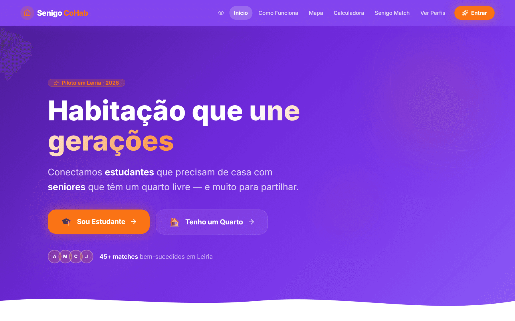
The landing screen asks one question and only one: which side are you on? The two buttons — "I'm a student" and "I have a room" — lead into the same questionnaire along different paths. Splitting the roles at the door avoids the generic screen that forces everyone to understand the product before they can use it.
Two explicit paths
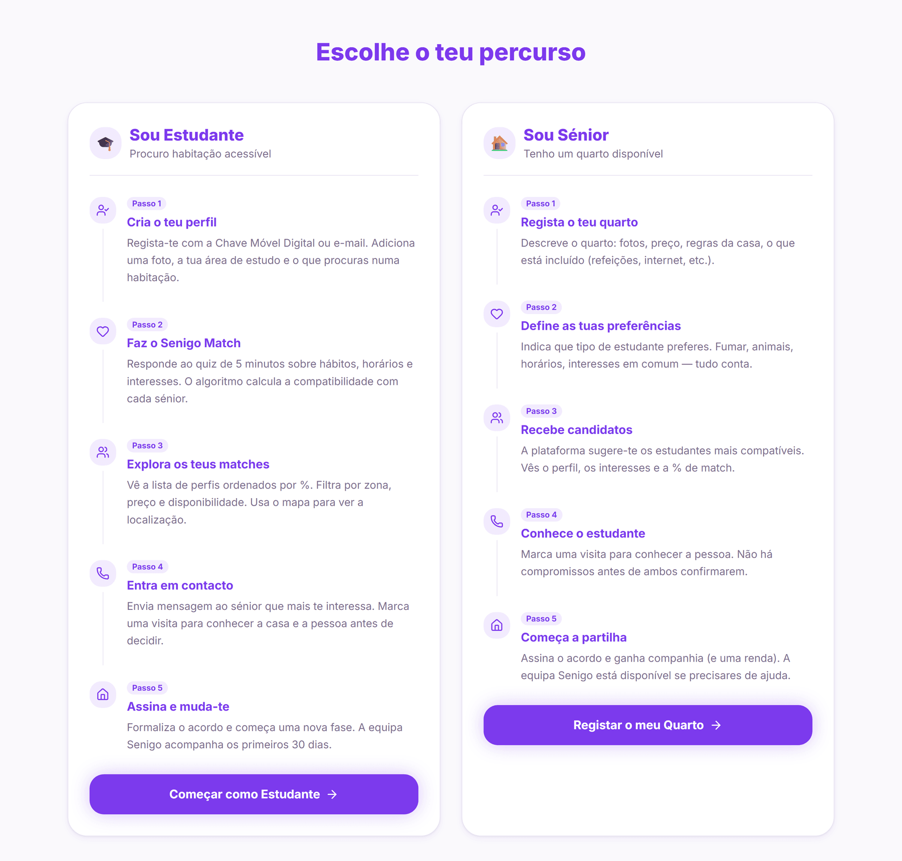
The "How It Works" page presents both paths side by side, in five steps each. They are genuinely different paths: the student searches, filters and makes contact; the older adult describes the room, sets preferences and receives candidates. Showing both in parallel answers the question each side asks — what does the other person see of me?
Senigo Match — the questionnaire
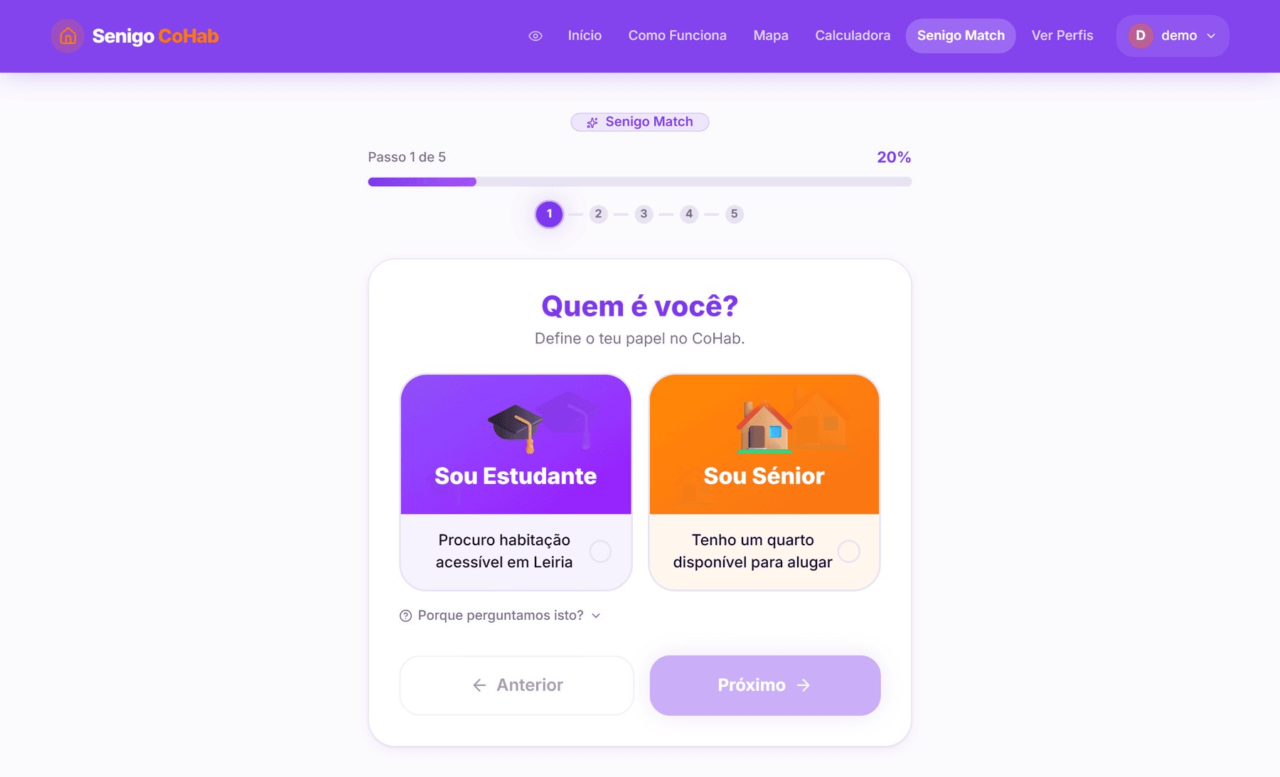
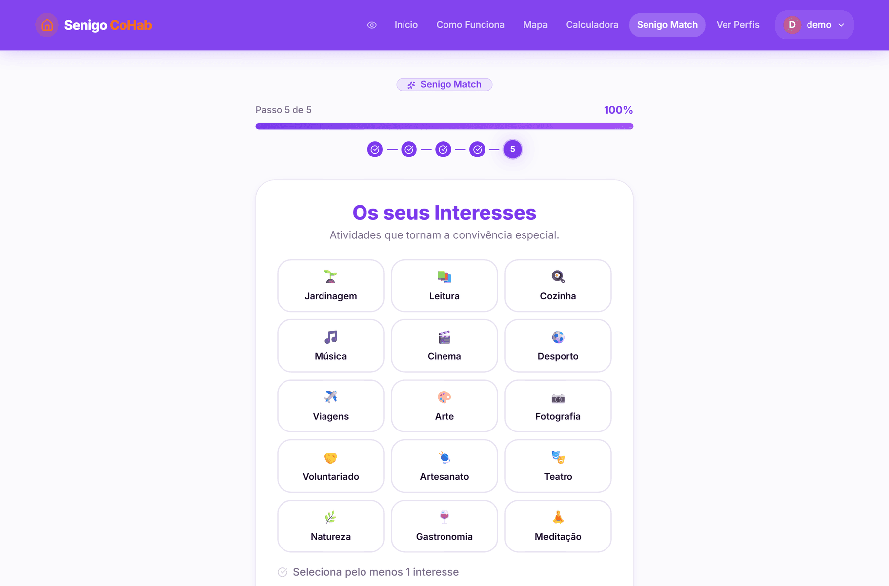
Five steps for the student, six for the older adult — who answers an extra step about the room on offer (zone, price, meals, internet). The questions cover user type, smoking, pets, daily rhythm and interests.
Progress is shown twice: a bar with a percentage and numbered steps. The redundancy is deliberate — one says how much is left, the other says where you are, and seeing both removes the feeling of an endless form.
Every step carries a quiet button: "Why do we ask this?". Opening it explains what that answer weighs in the result — that opposite schedules are the most common cause of conflict, say, or that a mismatch on smoking tends to be disqualifying. The questionnaire explains itself rather than asking for data without justification.
The compatibility algorithm
Compatibility is calculated out of 100 points, spread across four criteria:
The rules reflect judgements about living together, not an arithmetic average:
- Neighbouring schedules are not penalised as opposites. A morning person and an afternoon person score partially; morning against night scores nothing and raises a blocker.
- A flexible schedule is treated as an advantage, not as a missing answer.
- Pets carry a soft penalty, not a disqualifying one — it is a negotiable difference, unlike smoking.
- Three shared interests are enough for full marks. More adds nothing: the goal is to make sure conversation is possible, not to measure affinity.
The algorithm does not just return a number. It returns the breakdown criterion by criterion, with a sentence of explanation for each, and a separate list of blockers — serious incompatibilities that appear named rather than diluted into the percentage. A 70% match with a schedule blocker is different information from a 70% match without one, and the product shows the difference.
The profile and its preview
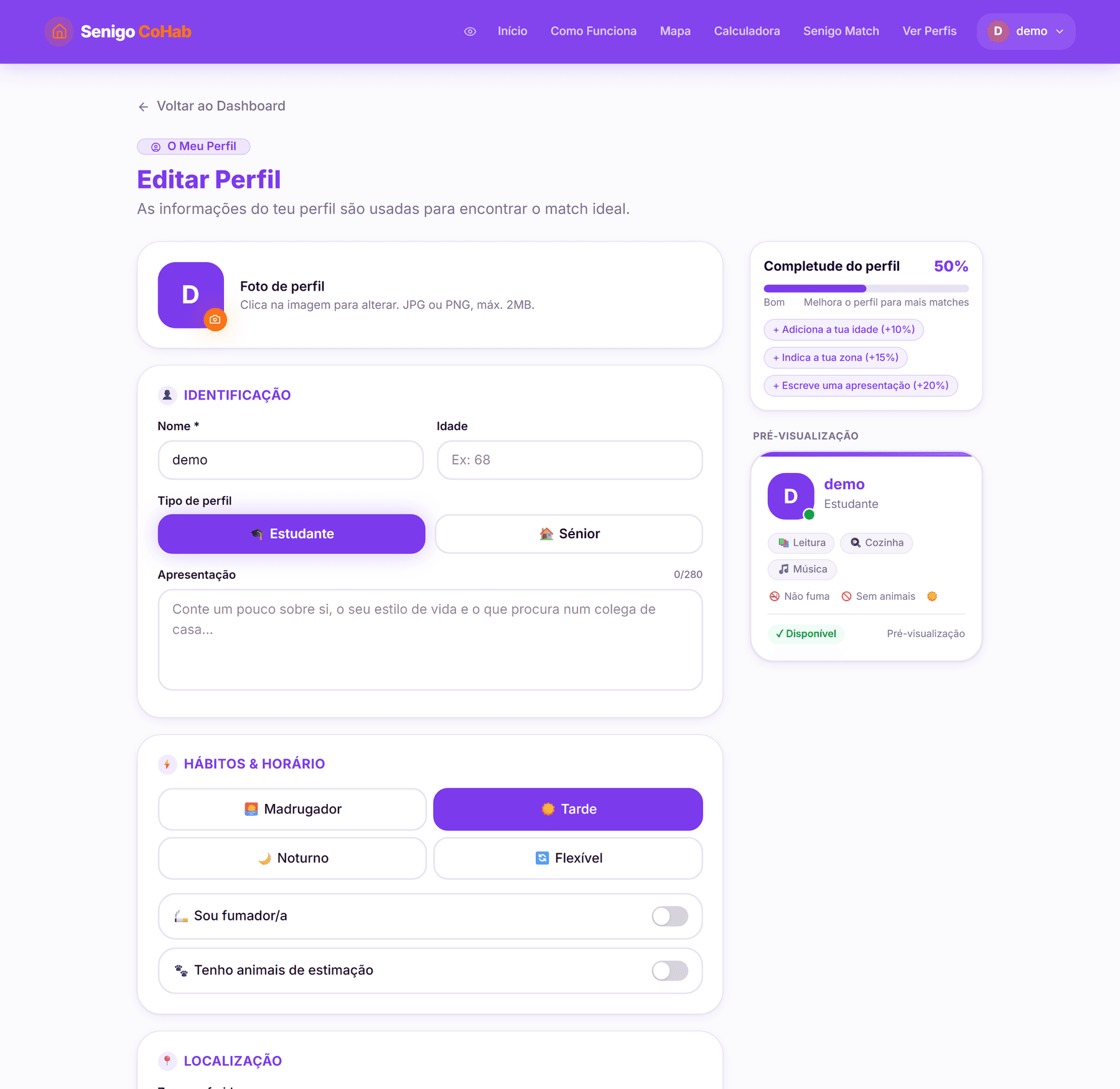
The preview is not hidden behind a button: it sits permanently on screen, next to the form. Whoever is filling it in sees at the same time what they are declaring and what the other person will read.
Profile completeness is a percentage with the suggestions named and what each is worth — add your age (+10%), set your zone (+15%), write an introduction (+20%). It says what is missing and how much it counts, instead of generically asking someone to "complete your profile".
The four daily rhythms — early riser, afternoon, night, flexible — are exactly the ones the algorithm uses. The profile and the match speak the same language, which removes the silent translation between what the person declared and what the system scored.
Discovery and comparison
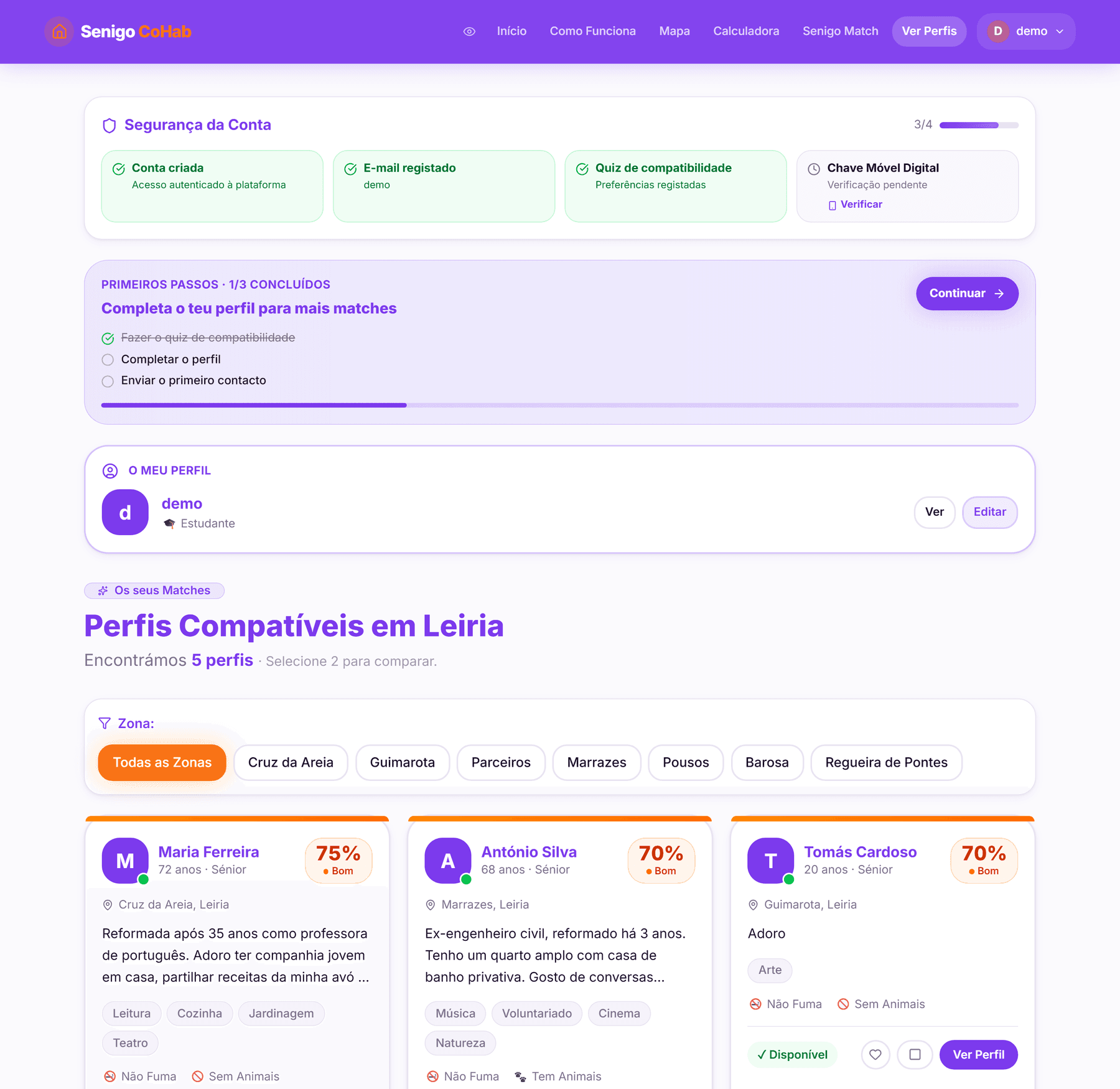
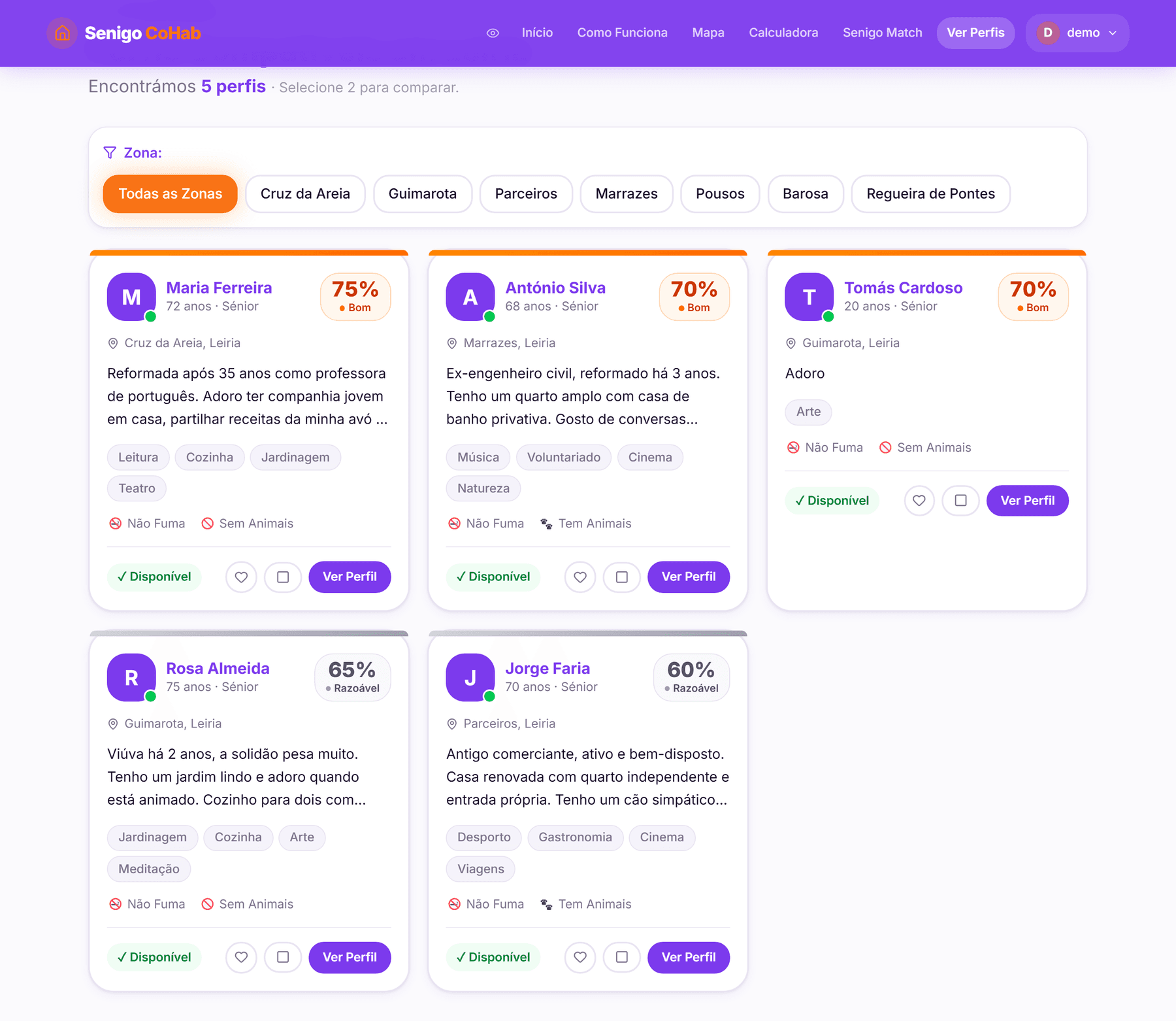
Profiles are ordered by percentage, with a zone filter and favourites. The percentage is translated into readable bands — Excellent, Very Good, Good, Fair — so the number does not have to be interpreted.
Each card carries what decides the matter before the profile is opened: age and role, zone, introduction, interests, and the two disqualifying habits — smoking and pets — in words, not an icon alone. The intent is that the list can be read without entering every profile to find out whether it is worth it.
There is a side-by-side comparison panel for two profiles, aligning zone, price, schedule, habits and interests, and highlighting the interests they share. It is the tool for the decision the person actually has to make: not "is this profile good?", but "which of these two?".
The same profiles, on the map
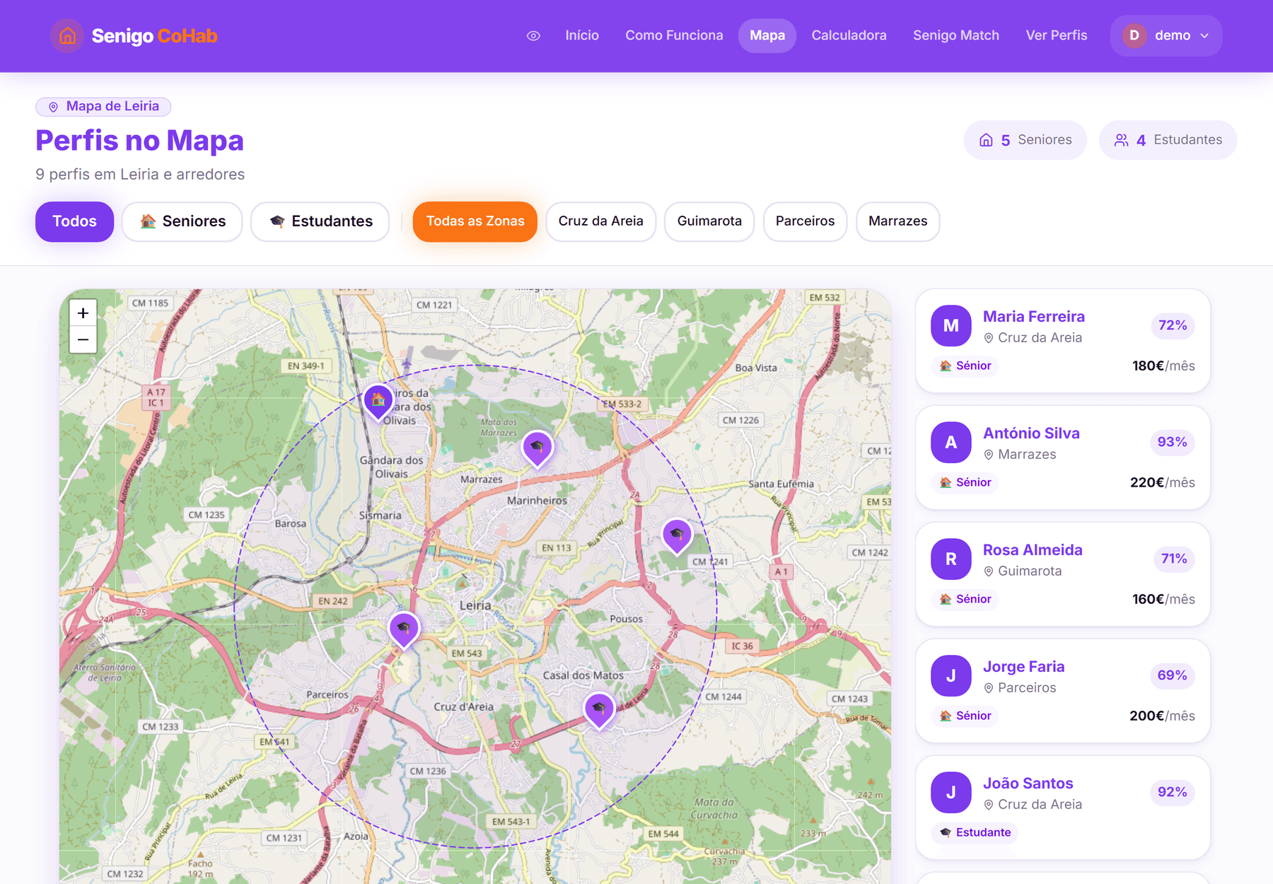
The pins distinguish the two roles, the circle marks the search area, and the side panel keeps what decides: zone, percentage and price per month.
For someone looking for a home in a city they do not know, the name of a zone is an abstraction until it is a point on a map. It is the same set of profiles, read through the question "where is this?" rather than "who is this person?" — and it is the view that answers distance to campus, which no list ordered by percentage can answer.
CoHab agreement summary
Before the first message of interest is sent, a summary of the agreement appears: who the two parties are, the room's terms, what is included — and, where they exist, the compatibility blockers, presented as a warning before contact rather than after it.
Formalising contact this way takes the weight out of the first message. The person is not "messaging a stranger"; they are responding to a concrete proposal they have already read.
Messages
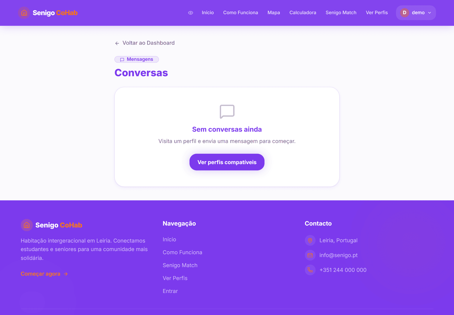
The empty state is not a blank screen with an icon: it says what to do next and takes you there with a button. It is the first screen anyone sees in this section — a conversation only exists once contact has been made — and so it is treated as a screen in its own right rather than as an error.
Savings calculator
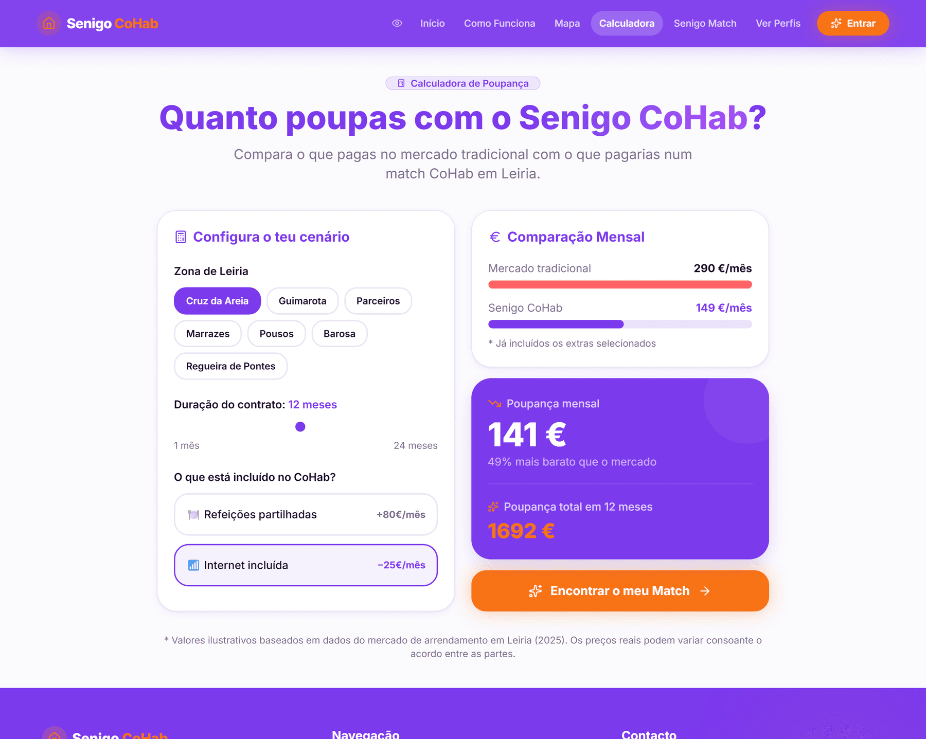
It compares market rent by Leiria zone with the estimated cost of a CoHab agreement over 1 to 24 months, with optional extras (meals, internet). It exists to make the economic argument concrete before sign-up.
Accessibility as a feature
There is a persistent accessibility control in the navigation bar, with two options: large text and high contrast. The preference is stored on the device and persists between visits — someone who needs this needs it every time, and should not have to ask twice.
High contrast is not an automatic filter: it is an alternative palette defined by hand, with reinforced borders and shadows. Large text raises the typographic base from 17px to 22px.
Guarantees and FAQ
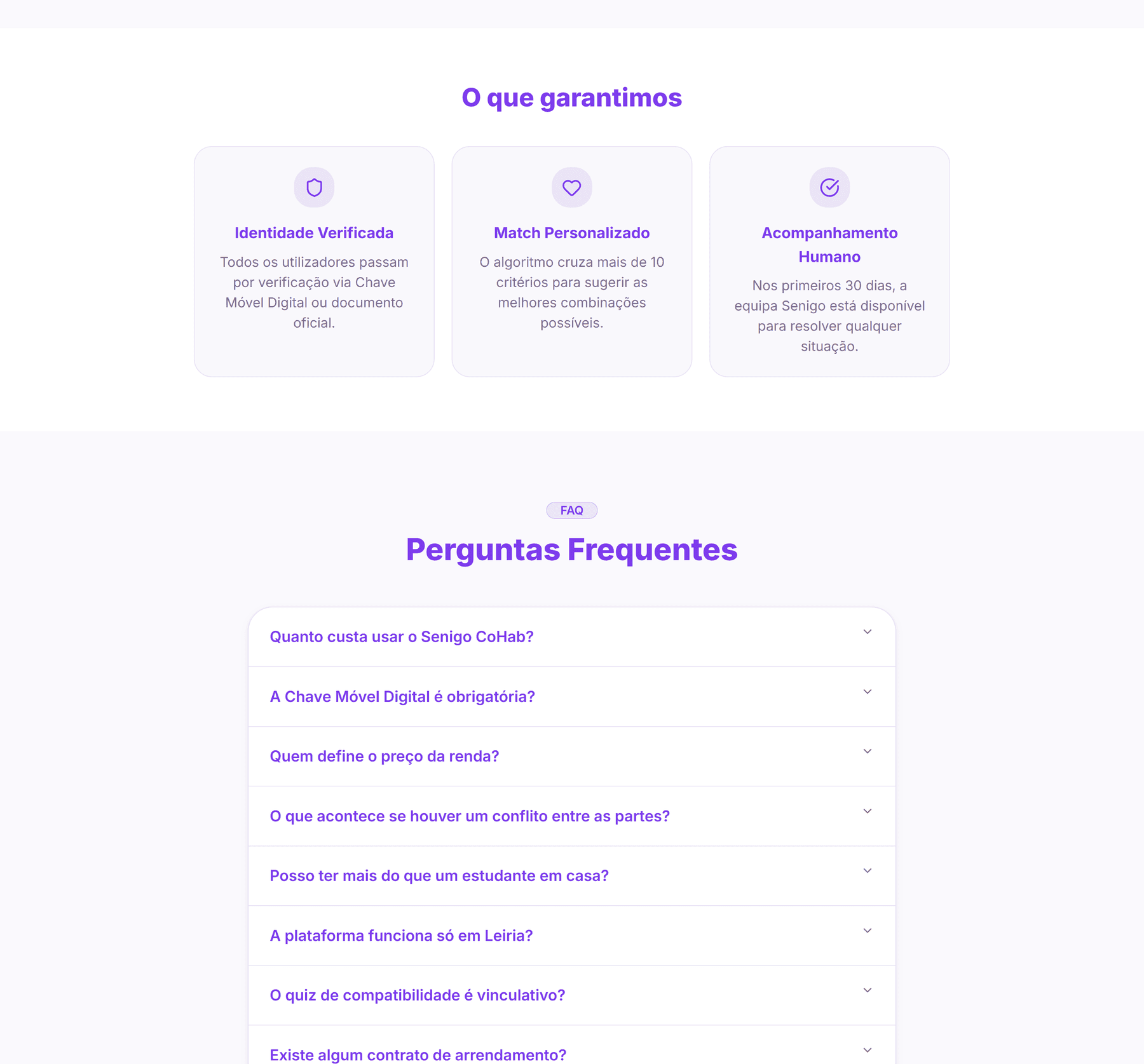
Authentication
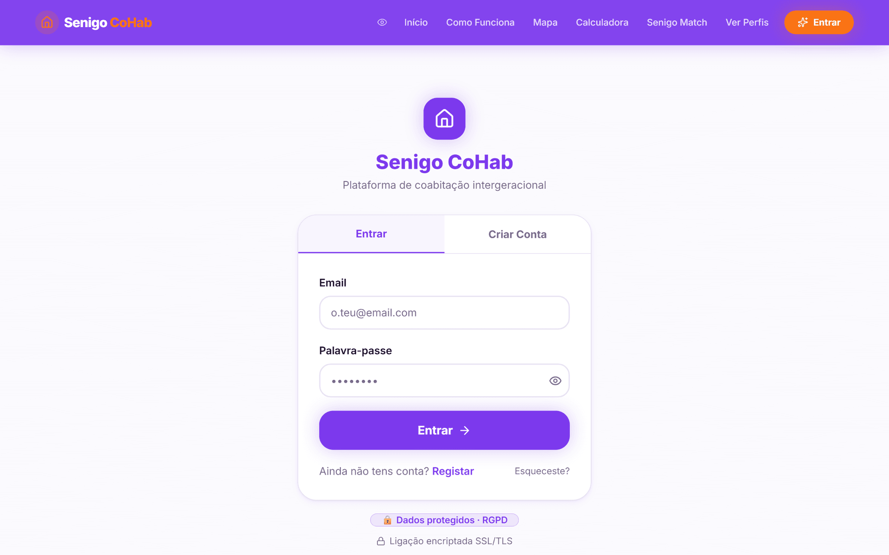
Registration and sign-in by email and password, with password recovery and confirmation by link. Data is protected by access policies at the database level: each person reads only their own messages, their own questionnaire and their own favourites.
Design / Process
This section is under construction. Below are the decisions that are already made and visible in the product. The process artefacts — wireframes, flows, research — do not yet exist in presentable form, and are marked as such.
Design decisions made
A 17px base instead of 16px. The product starts with larger body text than usual, and the typeface is Inter, chosen for on-screen legibility. The decision comes from the older adult: rather than treating accessibility as an alternative mode, the default state is already more legible, and the large-text mode (22px) is the reinforcement.
The questionnaire justifies every question. Asking someone to declare smoking, pets and routines demands something in return. The "Why do we ask this?" on every step gives that in return without forcing anyone to read it.
The percentage is explainable. The algorithm was built to return the breakdown, not just the result. An opaque percentage in a context like this would be asking for blind trust in a decision with real consequences — who you are going to live with.
Blockers are named. Serious incompatibilities appear as a separate list, in plain language, instead of quietly lowering the score.
The city is a parameter. Leiria, its seven zones and the corresponding coordinates are isolated as constants. The pilot was built to be replicated.
Visual system
- Violet#7C3AEDPrimary colour
- Orange#F97316Accent and action
- Lavender#F5F3FANeutral backgrounds
0.875remcorner radius, soft shadows in a violet tone- Inter throughout
- A complete alternative palette for high-contrast mode
Still to document
- Wireframes. They do not exist in the repository.
- User flows. The paths are implemented, but not drawn as a diagram.
- User research. It was not done.
- Usability testing with older adults. It was not done, and it is the project's most significant gap: the product was designed around an older user whose real behaviour has never been observed.
- Design system documentation. The tokens exist in code, not as a document.
Prototype
The interactive Figma prototype covers the main paths on both sides of the platform.