Case study
Product Design · UX/UI · Product Strategy

SeniGo

Everyday help for older adults, arranged with the trust that decision actually requires.

Visit the site ↗Read the case study ↓
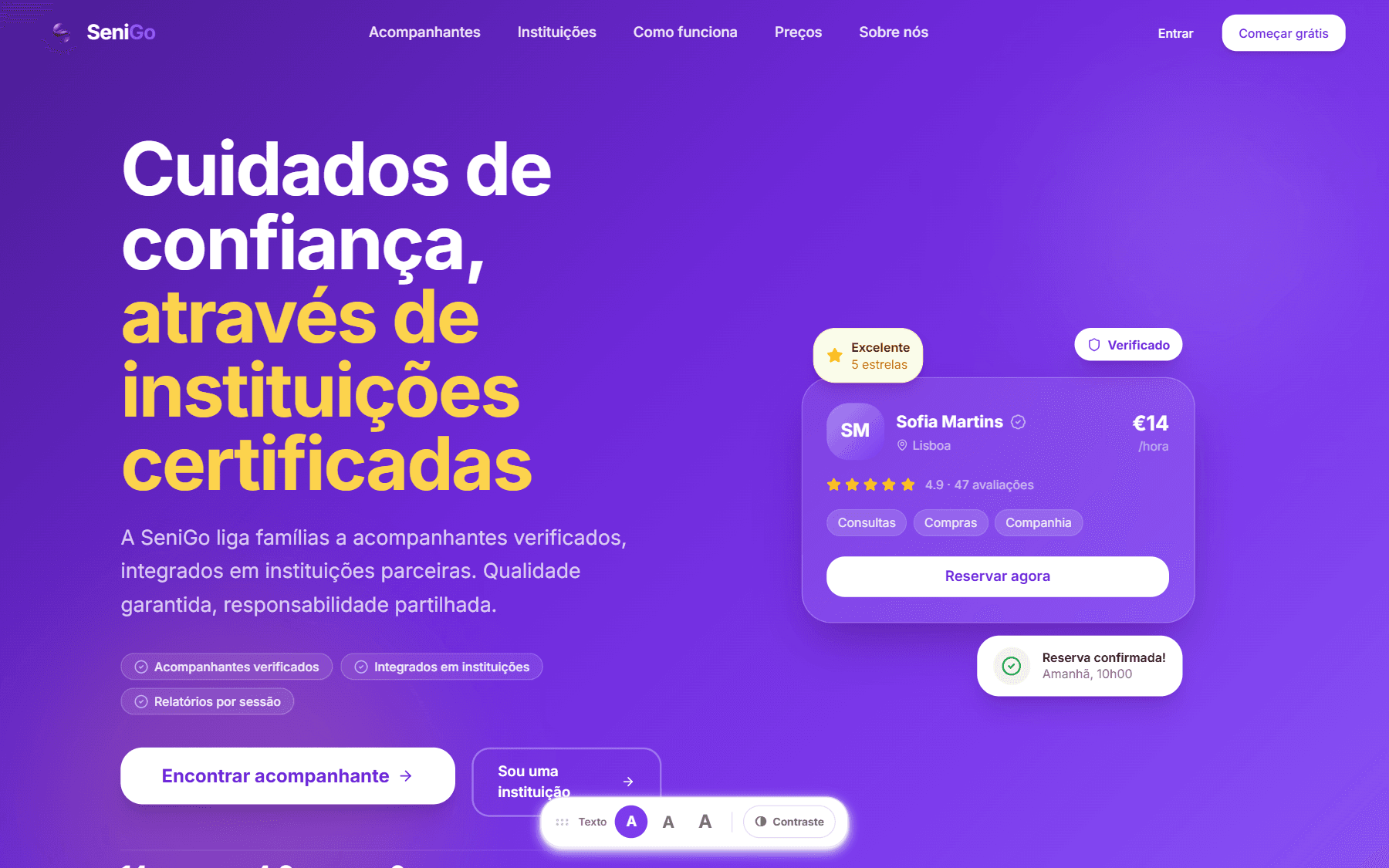
SeniGo landing page
(01)SeniGo

Overview

SeniGo — verified companions for everyday life, backed by certified institutions.

SeniGo is a two-sided platform where older adults, and the families who help them, book verified companions for the ordinary tasks that make living at home possible: groceries, medical appointments, walks, company, errands, home help, transport.

It began as an open marketplace where anyone could sign up to help. That model was abandoned — on paper, before a line of code was written — in favour of something more defensible: an escrowed care network where every companion is identity-checked, trained, and accountable to a certified institution. That pivot is the spine of this case study, and it is the decision I would most want to be asked about.

Role
Founder and product designer — problem framing, product strategy, IA, UX flows, UI system, and the working build.
Timeline
Concept from August 2025. Pivoted and entered into innovation and entrepreneurship programmes through to spring 2026. Designed and built May–July 2026.
Recognition
Selected twice for StartUp Voucher (IAPMEI). Neither place was taken up — studying full time at the time made it impossible.
Type
Founder-led venture.
Design
Design system built on Radix primitives, custom tokens, motion and accessibility layer.
Build
Next.js 15, TypeScript, Tailwind, PostgreSQL/Prisma, Clerk, Stripe Connect, Resend, Leaflet.
Language
Portuguese (pt-PT), designed for the Portuguese market.
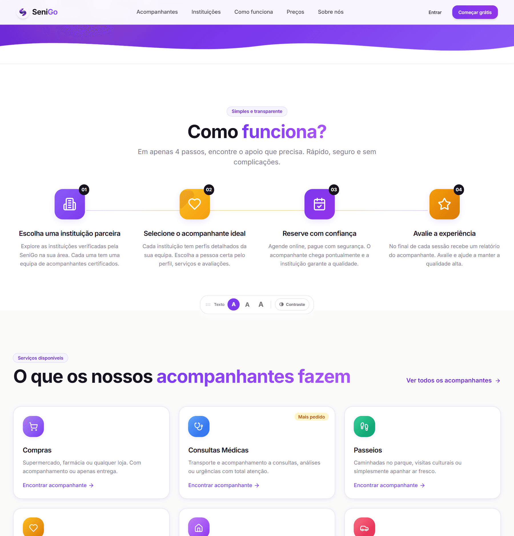
SeniGo how-it-works steps followed by the grid of services companions provide
The four steps, and the everyday services the whole product is built around.

What makes it worth reading: this is not a set of screens. It is a product with a working transaction, a verification pipeline, an escrow model, a dispute process and four distinct user roles — which means every design decision had to survive contact with a real constraint.

(02)SeniGo

The problem

Most older adults want to stay in their own homes. What stands between them and that is rarely a medical need — it is a series of small, ordinary tasks: getting to a consultation across town, carrying shopping up two flights, having someone to talk to on a Tuesday afternoon.

Those tasks fall into a gap. On one side, informal help: a neighbour, a relative, a name passed between friends. On the other, formal home-care agencies: contracts, minimum hours, monthly commitments, assessments. Neither fits "I need someone to come with me to the hospital on Thursday."

The core problem is not a shortage of people willing to help. It is that there is no trustworthy, low-commitment way for the two sides to find each other.

Why this is worth solving

The demographic direction here is well known, and I deliberately did not build the case on figures I had not verified myself. What I did rely on is structural: the "occasional, light-touch help" band is genuinely underserved by both the informal and the formal option, and that gap does not close on its own. It is a durable problem, not a moment.

On the older adult's side

  • Discovery runs on luck. Finding help means knowing the right person. That does not scale, it does not travel between cities, and it carries no guarantee.
  • The formal alternative is oversized. Agency contracts are built for continuous care. Someone who needs four hours a month is priced and processed as if they needed forty.
  • Trust is the real blocker, not supply. Letting a stranger into your home — or into your mother's home — is a far higher-stakes decision than ordering a ride or a meal. The bar for "how do I know this person is safe?" is different in kind, not degree.
  • Digital friction compounds all of it. Small text, dense forms, unclear next steps, and payment flows written for people who bank on their phone every day. A person can be perfectly capable and still be defeated by an interface that assumes fluency.
  • The person searching is often not the person being helped. Usually an adult child. That splits the product's audience in a way most marketplaces never have to handle.

On the companion's side

  • The work is real but invisible. Word of mouth, cash, no record. Nothing accumulates.
  • No credential travels. Someone with ten years of experience arrives at every new family as a complete unknown, and has to earn trust from zero each time.
  • Getting paid is a relationship problem. Chasing money from someone you have just spent the afternoon helping — sometimes a person who is vulnerable — is awkward in a way that ordinary freelancing is not.
  • There is no protection when something goes wrong. A disputed service, a no-show, an accusation. Informal work means informal consequences, and the person with less power absorbs them.
  • Income is unpredictable and unprovable — which matters for anything from a lease to a loan.

How I framed it

How might we make occasional, everyday help as easy to arrange as a booking — without losing the trust that makes someone willing to open their door?

Every decision in the sections below traces back to the second half of that sentence.

(03)SeniGo

Users

The product ended up with four distinct roles, each with its own area, navigation and rules. That was not a structural convenience — it came from the realisation that these groups share almost no tasks.

1 · The older adult

Needs help with a specific task on a specific day, and to arrange it without feeling like a burden.
Goals stay independent; keep control of who comes into the home; not have to involve family for every small thing.
Difficulties digital confidence varies enormously; small targets and dense forms; multi-step processes where it is unclear what has already been committed to. A confirmation and a payment can easily blur into one another.
Concerns Who is this person? Are they safe? How much will it cost? Can I cancel? What happens if it goes wrong?

The design consequence: every step has to be legible, and either reversible or clearly explained before it is taken.

2 · The family member — the shadow user

Frequently the one who searches, evaluates, compares and pays, while the older adult is the one served. They are anxious, time-poor, and acting on someone else's behalf.

This is the clearest gap in the current product. There is no way for an adult child to hold an account, manage a parent's bookings, or be notified when a service is confirmed. I only identified it properly late, and it is the first thing I would build next. Naming it honestly matters more than papering over it.

3 · The companion

Needs a steady flow of requests, a way to be trusted quickly, and reliable payment.
Goals turn informal, cash-in-hand work into something that looks and behaves like a profession.
Difficulties proving trustworthiness without a track record; the cold start of zero reviews; administrative overhead they did not sign up for.
Concerns being paid on time, being protected in a dispute, and not having to fight for either.

4 · The institution

Care homes, day centres, care companies and clinics.

Needs visibility, a channel to place their staff, and oversight of what is done in their name.
Goals extend their service beyond their own walls and use existing capacity.
Concerns reputation above all — their name is attached to whoever they vouch for, which makes them a demanding but extremely valuable partner.

5 · The platform operator

Not an afterthought. Verification, dispute resolution and accountability are daily operational work, so the admin area is a designed product in its own right — including a full history export for law-enforcement requests, because a platform that puts strangers in homes will eventually receive one.


All five profiles are reasoned from the problem domain and the product's own requirements. They are not derived from interviews — see the next section.

(04)SeniGo

Research & discovery

Nine months before the first line of code

The idea dates from August 2025. Development did not start until May 2026.

The months in between went into the concept: defining the problem, pressure-testing the model, and pivoting once — substantially, and on paper. That sequence was deliberate, and it is the part of the process I would most want to be judged on. The riskiest thing about this product was never whether it could be built.

What I actually did

Domain framing. I mapped the existing ways this help gets arranged today — informal networks, home-care agencies, classifieds and Facebook groups — and looked at what each one gives up. Informal help is trusted but unaccountable and unfindable. Agencies are accountable but oversized and slow. Classifieds are findable but carry no trust at all. No option holds all three at once.

Adjacent-product analysis. I looked at how general task marketplaces and on-demand platforms solve matching, and concluded that most of their patterns are the wrong ones to copy here. They optimise for speed, price comparison and low commitment. Care needs close to the opposite: verification, accountability, and a slower, more deliberate path to commitment. Borrowing a food-delivery checkout pattern for this would be actively harmful.

Assumption mapping. Rather than pretend to have validated findings, I wrote down what had to be true for the product to work and ranked the assumptions by risk. The riskiest one was not "will people want this" — it was:

Trust, not supply or demand, is the binding constraint. If we can manufacture trust credibly, the marketplace works. If we cannot, nothing else matters.

Everything else in the product was then designed as an answer to that assumption. That is why verification, escrow, session reports and dispute resolution exist before nicer discovery or a mobile app.

Putting it in front of people who owed it nothing

Through that period I put SeniGo through external programmes rather than keeping it on paper.

I entered IAPMEI's StartUp Voucher twice, and was selected both times. I took up neither place — I was studying full time, which made the commitment the programme requires impossible. I also applied to an acceleration programme at Startup Leiria and was not accepted.

None of this is user research and I will not dress it up as such: a jury is not a customer, and being selected is not evidence that anyone wants the product. What it did do was force the argument to be made repeatedly, in a fixed amount of time, to commercially-minded strangers with no investment in being convinced.

That is where the original model came apart. Defending anyone can sign up to help to people whose first instinct is to look for the liability made it obvious that the answer I had was not good enough.

The pivot: from "anyone can help" to "only through an institution"

The original model was open. Anyone could register as a companion, pass a verification check, and start accepting work — a conventional peer-to-peer marketplace.

I abandoned it before development started. The reason was risk.

In an open model, the platform's only defence is a check performed once, at signup. If that check is wrong, or if someone changes after passing it, nothing else stands between a stranger and a vulnerable person alone in their home. A criminal-record check on day one says nothing about day two hundred. The platform ends up carrying full responsibility for a danger it has no continuing ability to see.

The change: a companion reaches the platform through a certified institution — a care home, day centre, care company or clinic — that vouches for them, manages them, and has its own name attached to their conduct.

What that buys is not a stronger check. It is continuing accountability, from an organisation that is inspectable, contactable, and has considerably more to lose than an individual does. It moves the product from we verified this person once to an institution stands behind this person.

It also changed everything downstream at once: the homepage now leads with "trusted care through certified institutions" rather than a list of profiles; supply acquisition became a B2B problem rather than a consumer one; and the information architecture grew a fourth role.

It is the single decision I would defend hardest, and the one that took longest to arrive at.

What I did not do — stated plainly

I did not run user interviews. I did not run usability testing with older adults. I did not run surveys, diary studies or any form of moderated session, and I have no quantitative data because the product has not been put in front of real users.

That means everything in this case study about senior usability is informed judgement, not evidence. It is reasoned from the domain and from accessibility practice, and it is exactly the kind of reasoning that usability testing exists to puncture.

This step could be deepened through:

  • 5–8 moderated sessions with adults aged 70+, ideally on their own devices in their own homes, watching the discovery → booking flow unassisted
  • Parallel sessions with adult children, to see where the two audiences actually diverge
  • Interviews with informal caregivers about how they currently find work and get paid
  • Conversations with two or three care institutions, since the whole institutional model rests on an untested assumption about their appetite to participate

I would expect that research to invalidate several things I currently believe. That is the point of doing it.

(05)SeniGo

User journey & flows

The senior's path, from need to help

1 · Trigger. "I have a consultation on Thursday and no way to get there." The need is specific, dated, and usually a little urgent.

2 · Discover. A public search page — no account required. Filters by city, service type, price and rating, with a map view. A geolocation shortcut fills the city field automatically, so the first interaction does not demand typing a location. Every result card carries the three things that answer can I trust this person: verified badge, rating, and institution name.

3 · Evaluate. The profile holds bio, services, languages, years of experience, availability and reviews — including the companion's replies to reviews, which say more about accountability than the star average does.

4 · Request. A booking form opens over the profile: service type, a plain-language title, date and time, duration, city, address, notes. The total price updates live as duration changes. No payment at this step.

5 · Wait for acceptance. The companion accepts or declines. Only after acceptance does payment appear.

6 · Pay → service → confirm → review. Payment is held by the platform, not passed straight through.

Why the order is that way

Asking for money before the other person has said yes would mirror a checkout, not a request for help. People do not commit funds before they know someone is coming. Splitting request and payment also removes a whole class of refunds, and gives the companion a real decision rather than an obligation.

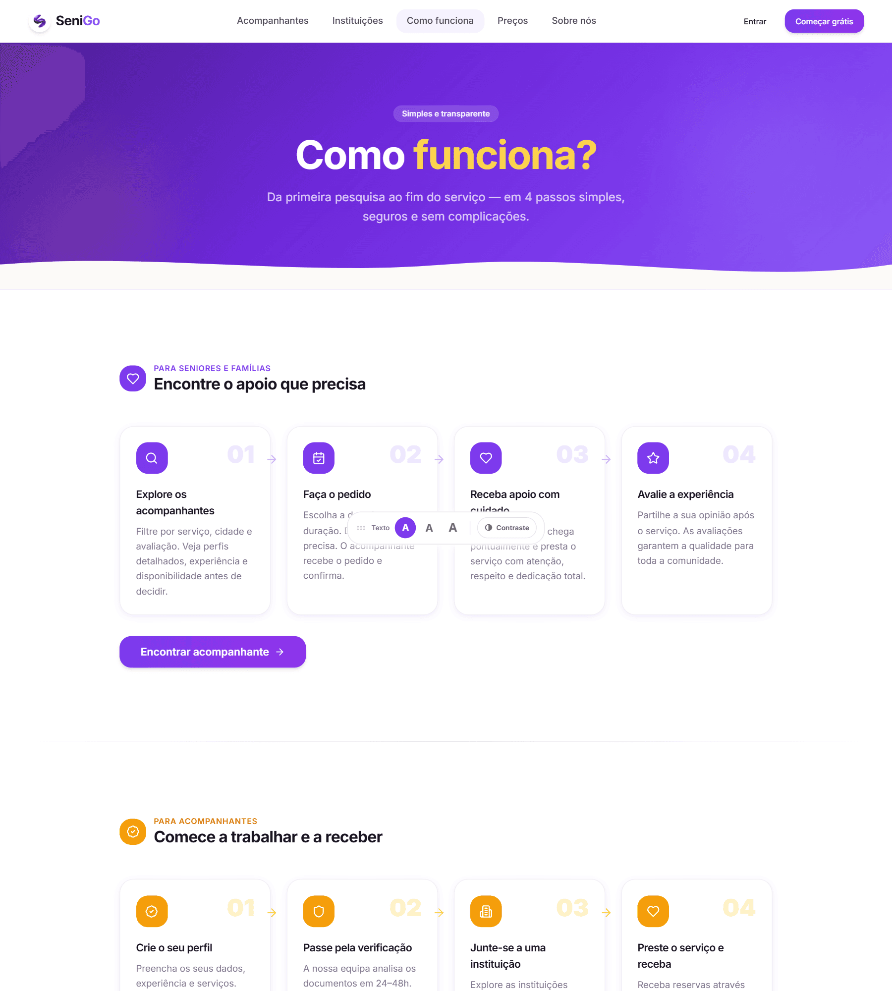
How it works page with four steps for seniors and families and four steps for companions
Both journeys set out in parallel: four steps for the family, four for the companion.

The companion's path

Sign up → choose role → profile and documents → pending review → human approval → mandatory training and quiz → Stripe onboarding → optionally join an institution → receive requests → accept → deliver → mark done → file session report → paid.

Three gates stand between signing up and earning. Each one is deliberate, and each one is covered in Key UX decisions.

The completion handshake

This is the part of the flow I am most satisfied with. Closing a booking takes both people:

  • The companion marks the service as done.
  • The senior confirms it happened.
  • Only then is the money released.

Neither side can close the loop alone. Three safety valves stop that symmetry from becoming a trap:

  1. If the senior never confirms, an automatic release completes the booking after 48 hours — so a companion is never held hostage by inaction, forgetfulness, or someone who simply does not use the app much.
  2. If the senior disputes, the booking moves to a disputed state and a human resolves it, with real refunds where the senior is right.
  3. The payout is blocked until the companion files a session report — a short account of what happened, any highlights, any incidents.

That third one is the piece of design I would point to first. It ties a quality obligation to the moment the companion cares about most, so the record gets written while it is fresh, and families gain a written trail of care they would otherwise never have.

(06)SeniGo

Information architecture

The product splits into two layers that do genuinely different jobs.

The public layer

Home, how it works, companions, institutions, pricing, safety, FAQ, blog, about, contact, legal.

Its job is persuasion and trust-building before anyone creates an account. Two decisions matter here:

  • Search sits in the public layer, not behind a login. A family should be able to browse real, verified companions in their city before committing to anything. Putting the proof behind a signup wall would be asking for trust before offering any. This is an acquisition decision as much as an IA one — it is also what makes individual companion profiles indexable.
  • Safety has its own top-level page rather than living inside the FAQ. If trust is the binding constraint on the whole business, the trust story deserves a destination, not a collapsed accordion item.
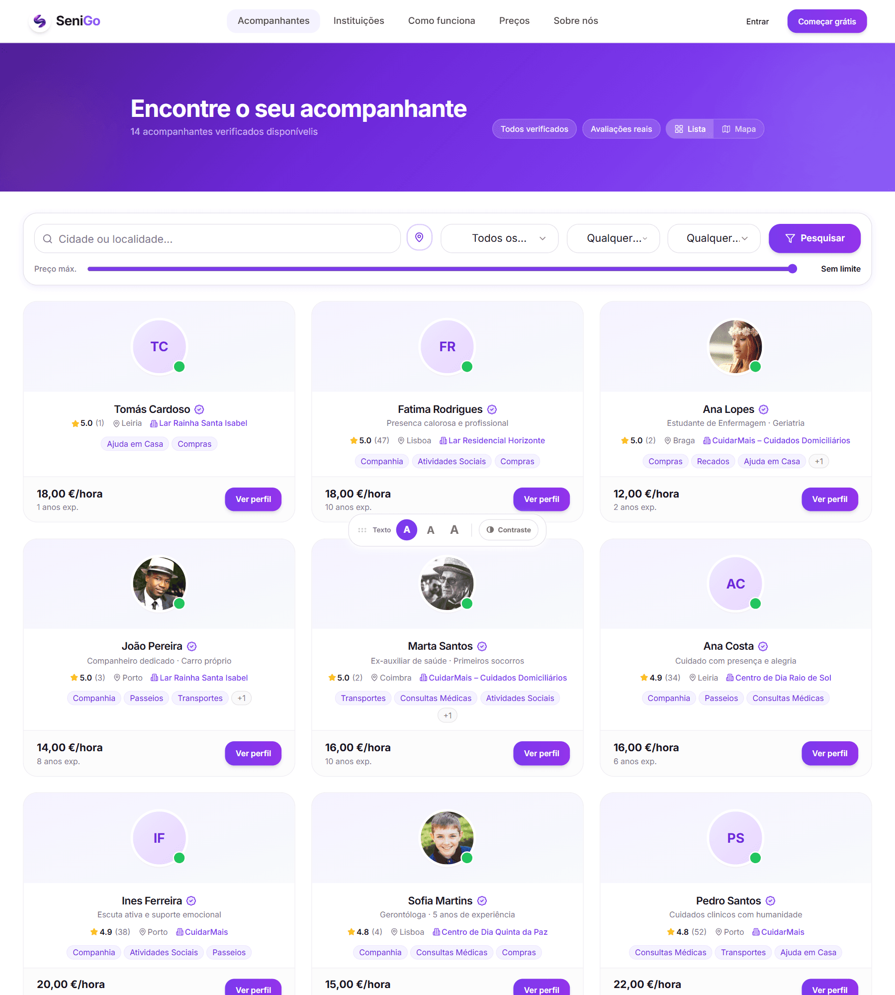
Public companion search with city, service and price filters and a list of verified companion cards
Search lives in the public layer: no account needed to see who is actually available.The companions, ratings and prices are seeded demo data. They are not real people and the reviews were never written by anyone.

The private layer

Role-adaptive: the sidebar renders a different product depending on who is signed in.

  • Senior: Home · Find · Bookings · Messages · Favourites · Notifications · Profile · Settings
  • Companion: Home · Bookings · Messages · Reviews · Earnings · Training · Notifications · Profile · Settings
  • Institution and Admin get separate areas entirely.

The reasoning

One account model, four products. A senior and a companion share almost no tasks. Showing a senior an "Earnings" tab would be noise, and would quietly suggest the tool was not built for them. Role-adaptive navigation is not a technical shortcut — it is what stops each person from having to filter out the half of the product that is not theirs.

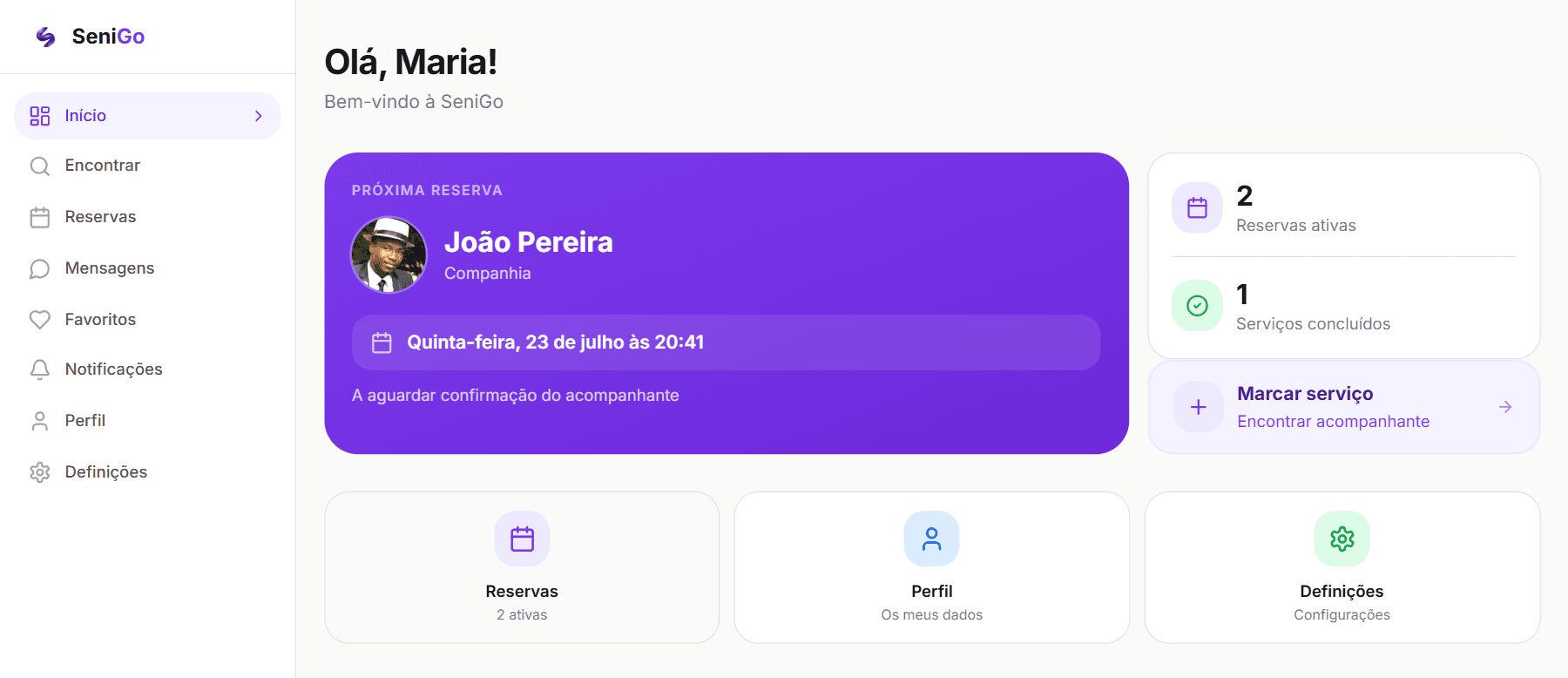
Senior dashboard with the sidebar Home, Find, Bookings, Messages, Favourites, Notifications, Profile, Settings
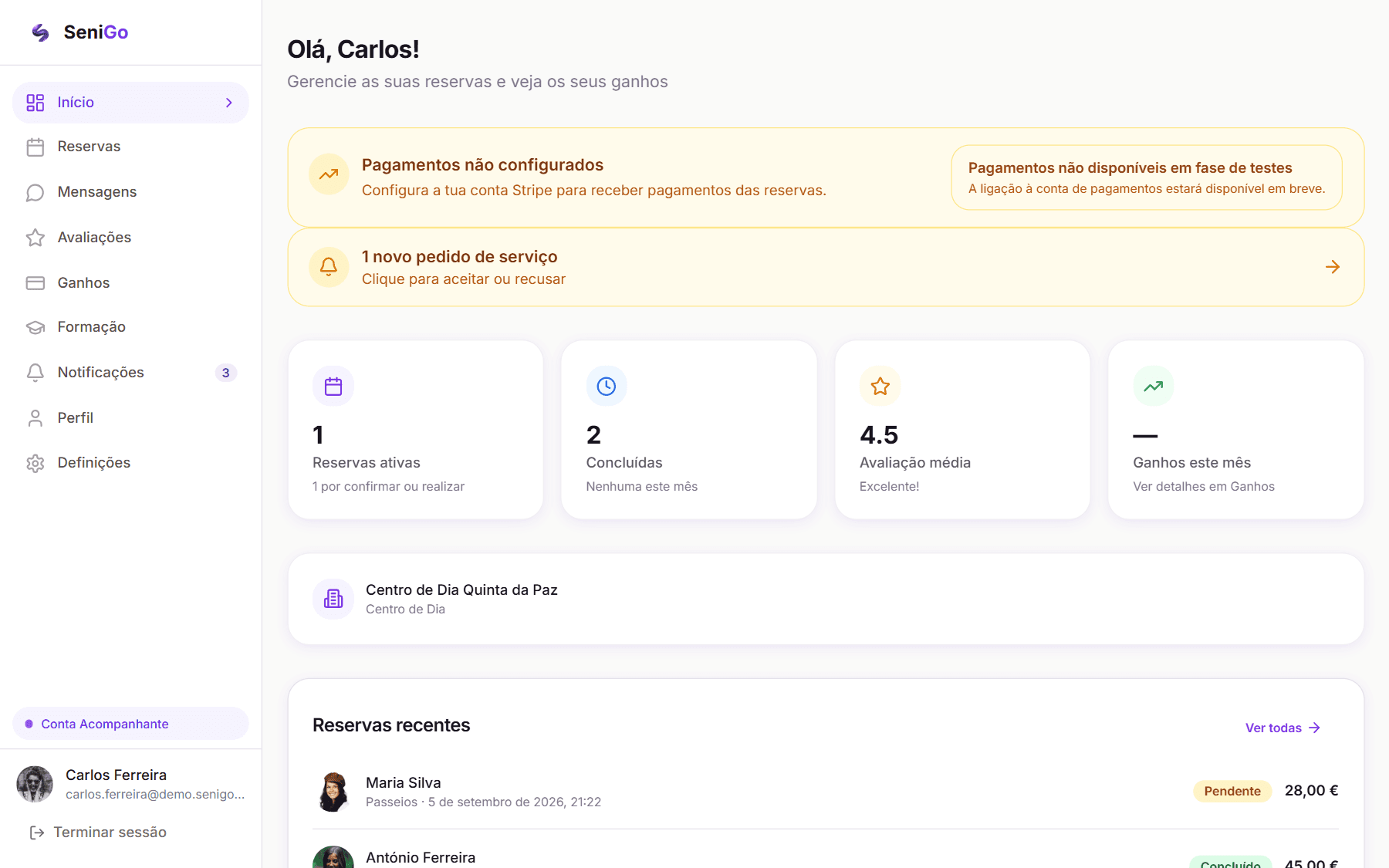
The senior's area: find, book, and the next booking with its status spelled out in words.Demo account, seeded data.
Companion dashboard with the sidebar Home, Bookings, Messages, Reviews, Earnings, Training, Notifications, Profile, Settings
The companion's area: the same shell, a different product — Reviews, Earnings and Training instead of Find and Favourites.Demo account, seeded data.

Bookings is the spine. Everything in the private layer hangs off a booking rather than existing as a parallel system: messages, the session report, the payment, the receipt, the review, the dispute. One object, one timeline, one place to look.

Messages are scoped to a booking, not a free-form inbox. Three reasons, in order of weight: it gives every conversation context so nobody wonders who is this and why are they writing to me; it keeps the relationship on the platform where the protections live; and it removes the moderation burden of an open messaging system. The cost is that two people who have worked together well cannot easily talk outside a booking — an accepted trade-off, revisited in What I would improve.

Verification state is shown asymmetrically. Only fully approved companions appear in public search, so a senior never has to evaluate whether someone is verified — the answer is always yes. Meanwhile the companion sees their own verification state prominently in their dashboard, because for them it is the most important thing on the screen. Same data, two audiences, two treatments.

(07)SeniGo

Wireframes & exploration

The exploration that mattered was structural, not visual. These are the alternatives I weighed and what decided each one.

Booking entry: full page or overlay

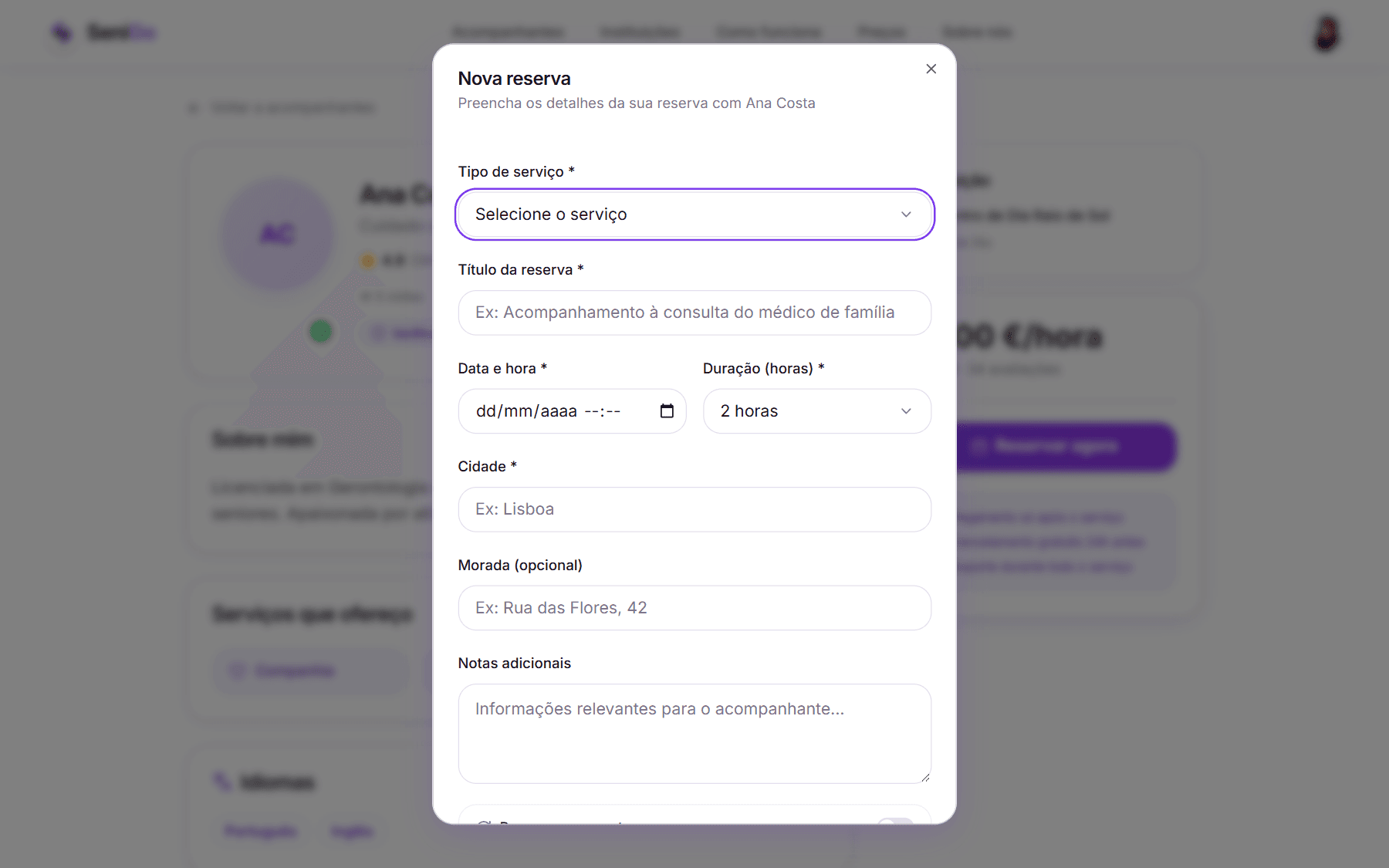
A dedicated booking page is easier to build and gives more room. I chose an overlay launched from the companion's profile instead, because a full page navigates away from the person you are booking at exactly the moment doubt arrives. Keeping the face, name, verification badge and rating visible behind the form means the decision stays anchored to a person rather than to a transaction.

How much the request should ask for

The minimum viable request is service type, title, date and time, duration, and city. Address and notes are optional at this stage.

That was a privacy decision as much as a friction one: a senior should not have to disclose their home address to send an enquiry that might be declined. The address becomes relevant once someone has accepted.

New booking overlay open over the companion profile, which stays visible behind it
The booking form opens over the profile, so the person being booked never leaves the screen.Demo account, seeded data.

Where cost is revealed

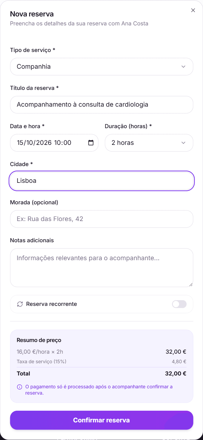
Options were a price at the end, a separate review step, or live calculation. I chose live: the total recalculates inside the form as the duration changes, with the breakdown sitting directly above the submit button. No surprise at the end, and no extra step whose only purpose is to say what the previous step already knew.

Filled booking form with duration as a select, optional address, recurrence toggle and a live price summary
Duration as a choice, address optional, and the price broken down directly above the button — including the line saying payment is only taken once the companion confirms.Demo account, seeded data.

Duration as choices, not a number field

One to twelve hours as discrete options rather than a free numeric input. It removes invalid values, removes decimal ambiguity, removes keyboard work on mobile, and turns a question that requires composing an answer into one that requires only recognising one. For this audience, recognition beats recall every time.

Onboarding: one long form or steps

The companion sign-up is genuinely heavy — identity documents front and back, criminal record, selfie holding ID, tax number, date of birth. A single scrolling form would read as a wall and lose people at the top.

I split it into two steps with an explicit progress indicator (Step 1 of 2, 50% → 100%). Role comes first, because role determines everything after it, and the indicator exists specifically to make a long second step feel finite.

Teaching the product rather than annotating it

Tooltips assume the user knows to hover, and hover does not exist on touch. I chose a short guided walkthrough for seniors — six steps covering welcome, finding a companion, making a booking, messaging, the profile, and where to get help — shown as a proper sequence with position indicators, so the person always knows how much is left.

(08)SeniGo

UI design

Hierarchy

One primary action per screen, expressed as a single filled button. Everything else is outlined or plain text. On a screen an older adult is reading, if two things look equally important then neither is.

Cards as the unit of content. Bookings, companions and notifications share one card anatomy, so a pattern learned in one part of the product transfers to the next.

Status is always a word, never a colour alone. "Waiting for confirmation", not an amber dot. Colour-blindness and the reduced colour discrimination that comes with age both point to the same conclusion, and the label is faster to read even for people with neither.

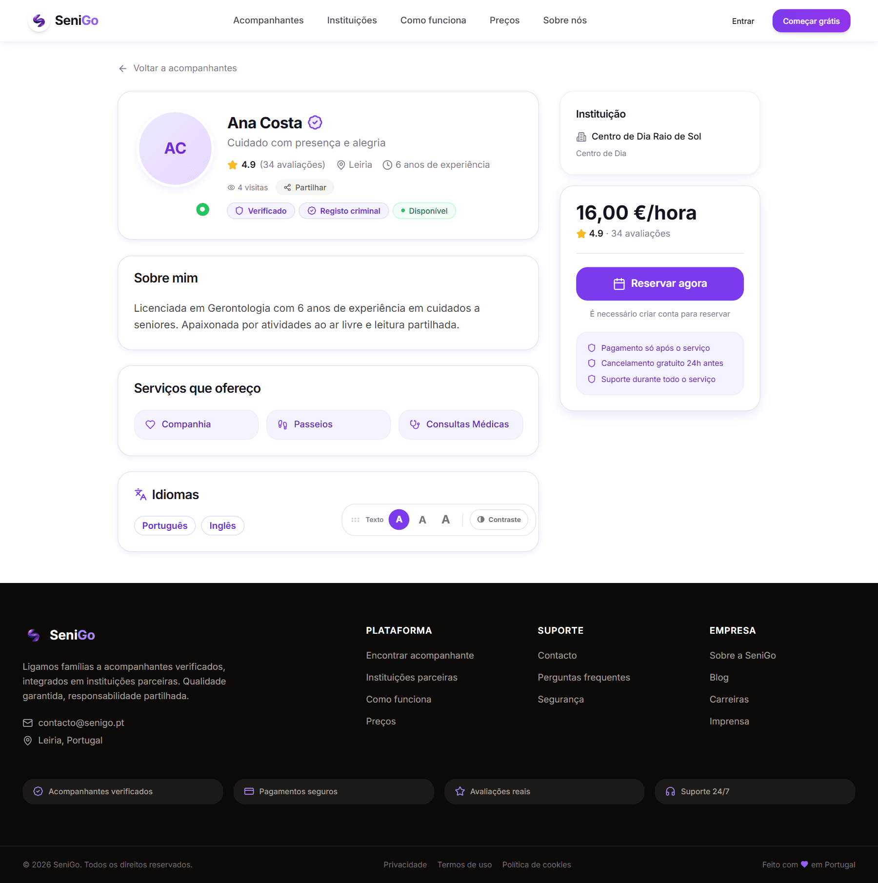
Companion profile page with verified and criminal-record badges, institution, services and booking panel
A companion profile: one primary action, trust markers first, and the terms stated before any commitment.Demo profile.

Typography

  • Inter, with contextual alternates enabled for cleaner letterforms at size
  • A 17px base instead of the usual 16. A small change that shifts the entire system, since every size downstream is relative
  • Three user-selectable sizes — 17 / 20 / 23px — applied at the root so the whole interface scales together rather than one text block growing inside a fixed box
  • Semibold headings with tightened tracking; generous line-height in running text

Colour

Deep violet as primary, warm amber as secondary, on white.

The reasoning is a positioning argument rather than an aesthetic one. This category defaults to clinical teal and medical blue — colours that read as institution, service, treatment. SeniGo is not a medical product and should not borrow the anxiety that comes with looking like one. Violet reads as considered and modern without reading as clinical; the warm amber keeps it human and is used sparingly for warmth and emphasis.

The intention throughout was that SeniGo should feel like a well-made consumer product, not a municipal service. The people using it are not patients.

The palette moved from teal to violet partway through the project, for exactly this reason.

  • Violet#7C3AEDPrimary
  • Deep violet#6D28D9Headers and gradients
  • Amber#FCD34DSecondary, used sparingly

Components

Built on Radix primitives — accessible foundations for focus management, keyboard interaction and ARIA that I did not want to reimplement badly. Customised throughout for larger touch targets, a softer corner radius, and low-contrast shadows rather than heavy elevation.

Accessibility as a system

This is the part I would most want judged, because it is built rather than claimed.

  • A persistent, draggable accessibility control offering three text sizes and a high-contrast toggle. It is draggable because any fixed control will eventually cover something on someone's screen, and its position persists between sessions.
  • High contrast is a full token override, not a filter. Pure black on white; borders darkened from very light grey to mid-grey so edges actually read; the primary violet deepened so white text on it clears contrast thresholds; and font smoothing switched off, because anti-aliasing thins letter strokes — working directly against the people who turned the mode on.
  • Preferences persist. Someone who needs 23px text needs it every single visit, and should never have to ask twice.
  • Visible focus rings with offset on every interactive element.
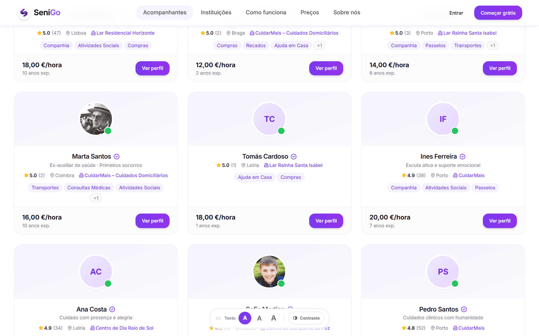
Companion search at the default text size, with the accessibility control visible
Default state: 17px base, with the accessibility control always on screen.
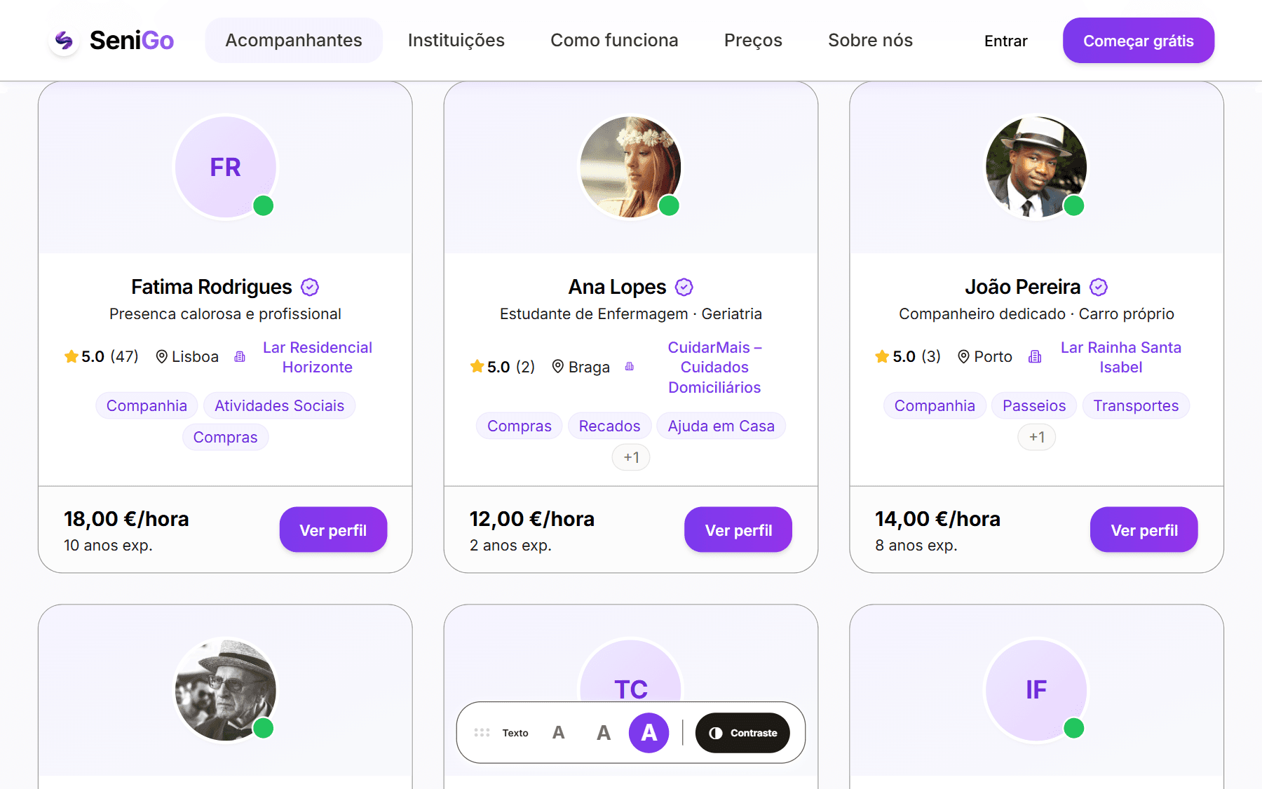
The same search at the largest text size with high contrast engaged
The same screen at the largest size with high contrast on — the whole interface scales, not one block of text.

One detail worth the mention because it sits exactly on the UX/engineering seam: changing the root font size recalculates every relative measurement on the page at once, which made the whole interface lurch. The fix is to freeze transitions for two animation frames during the switch. An accessibility feature that looks broken when used will not be used twice.

Designing for trust, visually

  • Verified badge on every card and every profile
  • Institution name as a second, independent trust marker
  • Ratings paired with a plain-language equivalent — "Excellent" rather than five stars alone
  • Full price breakdown shown before any commitment
  • A dedicated safety page setting out the verification chain step by step
(09)SeniGo

Key UX decisions

01

Payment comes after acceptance, not with the request

Problem
Asking for card details at the moment of enquiry treats a request for help like a checkout, and commits money before anyone has agreed to come.
Decision
The request is free and non-binding. Payment only appears once the companion has accepted.
Why
It matches how people actually arrange help — you ask first, you commit once someone says yes. It also gives the companion a real decision rather than an obligation, and avoids a whole category of refunds.
Expected
Higher request rates, fewer abandoned bookings, and less anxiety at the highest-friction moment.
02

A two-sided completion handshake, with a 48-hour release

Problem
If the companion alone closes a booking, the senior has no leverage when a service was poor. If the senior alone closes it, the companion can be left unpaid by inaction.
Decision
The companion marks the service done; the senior confirms; payment releases. If the senior does not respond within 48 hours, it releases automatically.
Why
Protection for the senior with a guaranteed ceiling on waiting for the companion. Neither side can hold the other still.
Expected
Confidence on both sides. The auto-release rate also becomes a useful signal — if it is high, confirmation is too demanding and that is a UX problem wearing an operations costume.
03

The payout is blocked until a session report is filed

Problem
Care quality is invisible after the fact, and families receive no account of what happened. Asking nicely for a report after payment would get reports from the people who least need to write them.
Decision
The companion files a short report — what happened, highlights, incidents — and the transfer will not process without it.
Why
It attaches a quality obligation to the moment the companion is most motivated, so the record is written while it is fresh.
Expected
Near-total report coverage, a written care history families would otherwise never have, and real evidence when a dispute is opened.
04

Messaging is scoped to a booking, not an open inbox

Problem
An open inbox invites unsolicited contact, needs moderation, and gives an older adult no context for who is writing to them.
Decision
Conversations exist inside a booking and nowhere else, with live updates.
Why
Context removes the who is this? question entirely; protections stay attached to the relationship; moderation load stays manageable.
Expected
Less anxiety, fewer safety incidents, less off-platform leakage. The cost is a weaker ongoing relationship between people who have already matched well.
05

Training is a gate, not a suggestion

Problem
Verifying someone's identity says nothing about whether they know what to do when an older adult falls, refuses medication, or becomes disoriented.
Decision
Four mandatory modules — first aid with older adults, ethics and privacy, communication, platform rules — followed by a quiz that must be answered perfectly. Bookings cannot be accepted until it is passed.
Why
These are situations with real consequences. A pass mark of "most of it" is not an acceptable standard for knowing the national emergency number.
Expected
Slower supply growth, accepted deliberately, in exchange for a materially lower chance of a serious incident.
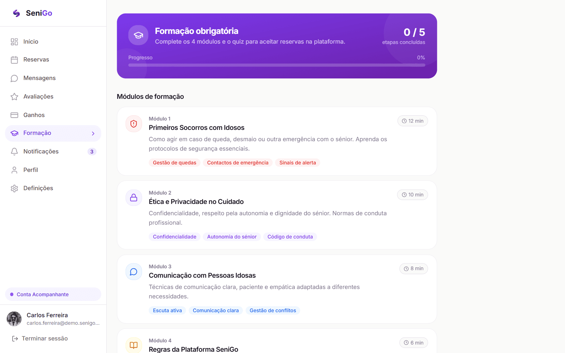
Training area listing the mandatory modules with their durations
The mandatory modules, each with the time it takes.Demo account, seeded data.
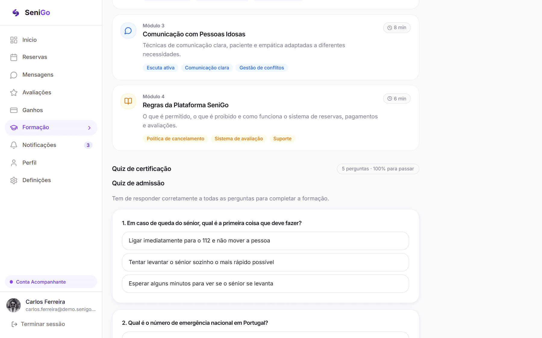
Certification quiz stating five questions and one hundred percent required to pass
The quiz that gates bookings: five questions, every one required — including the national emergency number.Demo account, seeded data.
06

Accessibility as a persistent control, not a settings page

Problem
Accessibility options buried in settings are found by the people who already know to look, which is rarely the people who need them.
Decision
A visible, movable control on every page offering text size and contrast, with the choice remembered.
Why
Someone struggling to read the screen cannot be expected to navigate three levels of that same screen to fix it. The problem has to be solvable at the point it is felt.
Expected
Actual use rather than nominal compliance — and a measurable one, since adoption of the larger sizes would be worth instrumenting.
07

Institutional affiliation as a requirement, not a badge

Problem
In an open marketplace the platform's only defence is a check run once, at signup. It cannot see what happens afterwards, which leaves the platform fully responsible for a danger it has no way to observe.
Decision
Companions reach the platform through a certified institution that vouches for them, manages them, and carries its own name on their conduct. The original open model was dropped before development began.
Why
It replaces a one-time check with continuing accountability from an organisation that is inspectable, contactable and has considerably more to lose than an individual. It also brings pre-verified supply in groups rather than one at a time.
Expected
A materially lower chance of a serious incident, higher conversion on the hardest decision in the product, and a route through cold start. This is a bet, not a proven result — and the cost is a much harder supply-side growth problem.
08

The home address is disclosed late

Problem
Asking for a home address at enquiry means handing it to someone who has not agreed to anything and may never reply.
Decision
Address is optional in the request and only becomes relevant after acceptance.
Why
Data minimisation as a courtesy, not just a compliance posture. This audience is a frequent target of fraud, and the product should not train them to give out their address casually.
Expected
Higher completion on the request form, and a habit worth reinforcing.
(10)SeniGo

Prototype

The prototype is not a clickable mock — it is a working product with a real database, real authentication, real payments in test mode, and real email. Every flow below can be walked end to end.

That choice cost visual iteration speed. What it bought is that the design was tested against real constraints: genuine loading states, genuine empty states, genuine error states, and payment states that only exist once money is actually involved.

Built to a date, for an audience

The build had a specific target: a working demonstration to take to Startup Leiria, from a standing start in May 2026. That constraint did more for scope discipline than any prioritisation framework would have. A fixed date and a live audience make it very clear, very quickly, which parts of a product are load-bearing and which are decoration — and it is why the transaction was finished before the discovery experience was made pretty.

Demonstrable flows

Senior — the core loop. Search with filters and map → open a profile → book with live pricing → pay → receive the service → confirm → leave a review. Includes the receipt and the booking timeline.

Companion — becoming bookable. Sign up → role → document upload → pending review → training modules and quiz → payment account setup → accept a request → deliver → file the session report → receive payment.

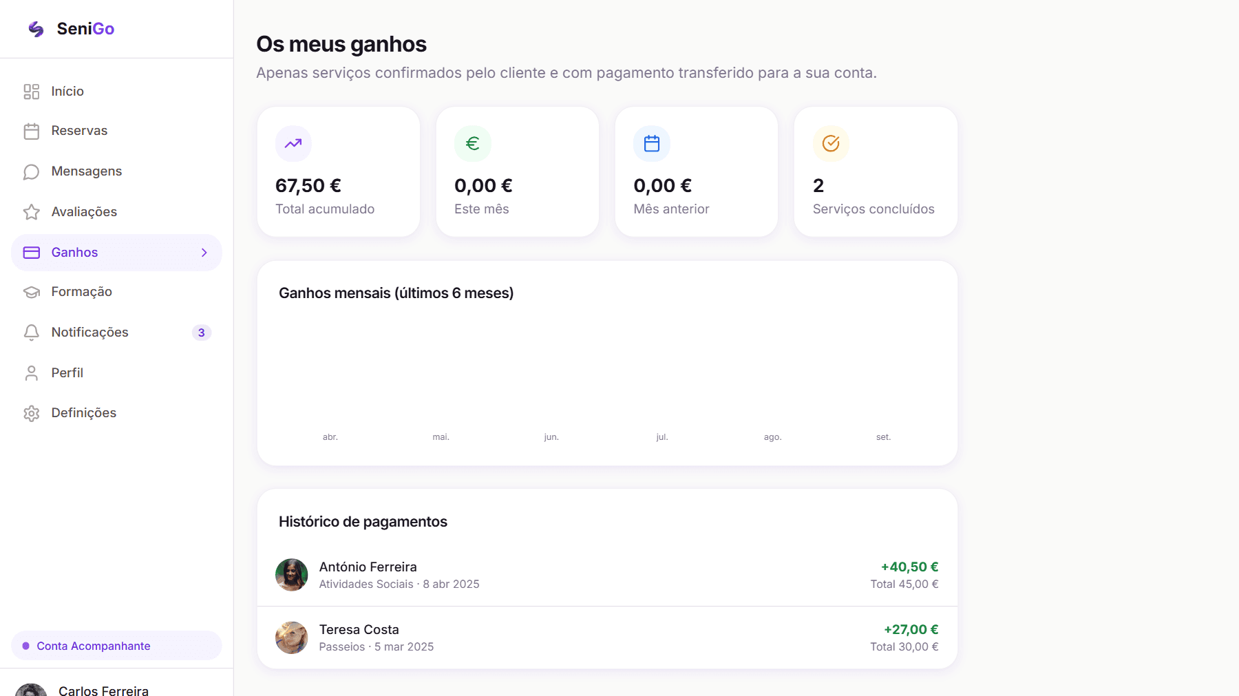
Companion earnings page stating that only client-confirmed services with transferred payment are counted
Earnings count a service only once the client has confirmed it and the money has moved — escrow, stated to the person waiting on it.Demo account, seeded data.

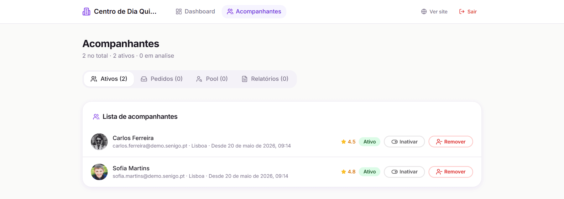
Institution — managing a team. Register → await approval → manage companions → handle join requests in both directions → invite from the pool of unaffiliated companions.

Institution area listing its companions with tabs for active, requests, pool and reports
The institution's own area: its companions, join requests in both directions, and the pool of unaffiliated companions to invite from.Demo account, seeded data.

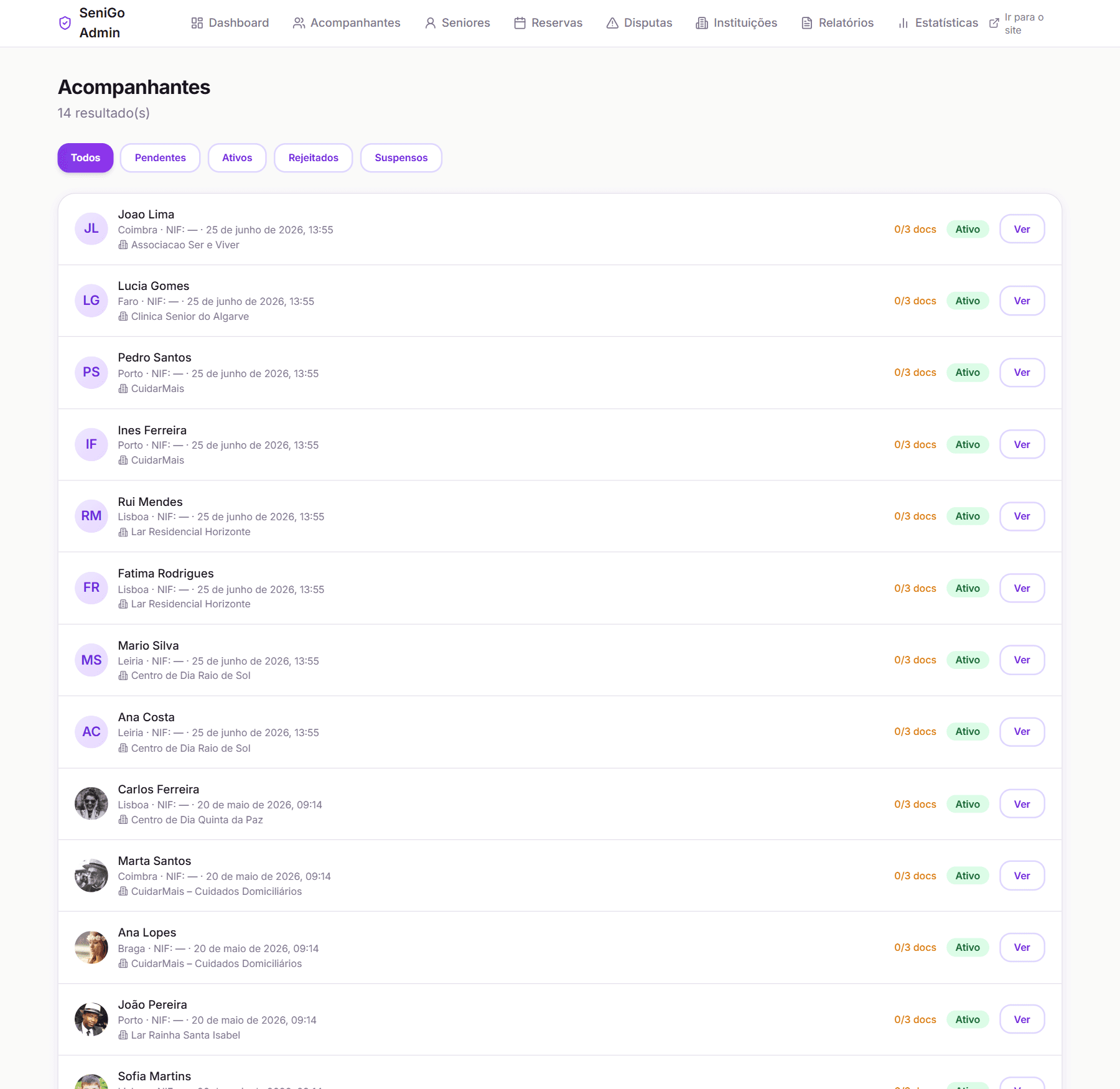
Admin — running the platform. Review a companion's submitted documents and approve or reject with a reason → resolve a dispute in either direction, including issuing a real refund.

Admin companion list filtered by pending, active, rejected and suspended, with document counts and institution
The admin area is its own product: every companion with their verification state, document count and institution.Demo account, seeded data.
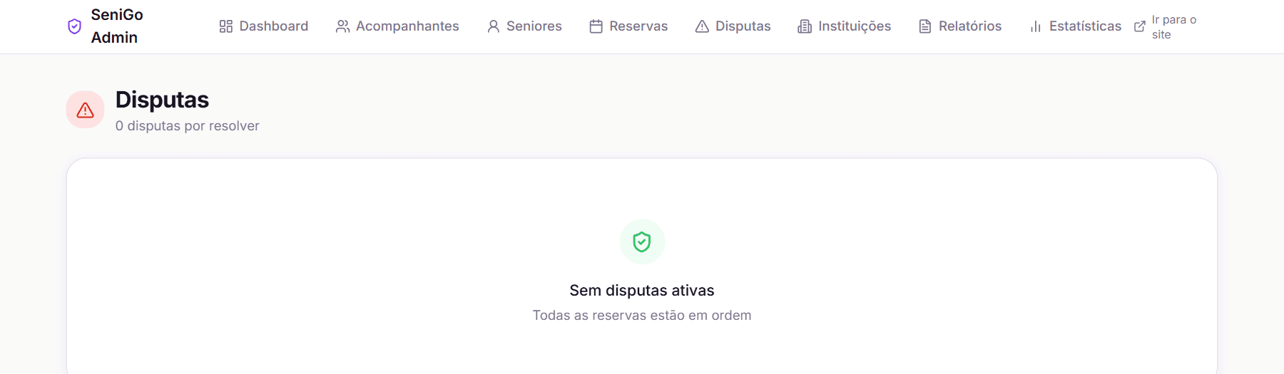
Admin disputes queue
Disputes get a queue of their own, because resolving them is daily operational work rather than an edge case.Demo account, seeded data.

Accessibility — across everything. Text size and contrast changed from any page, persisting across navigation and sessions.

Demo access

A dedicated demo entry point signs a visitor straight into pre-seeded accounts — one senior, one companion who also manages an institution — with a single click and no registration. It exists specifically so the product can be shown to someone who will not create an account to see it, which is every recruiter and every potential partner.

(11)SeniGo

Product thinking

Concept first, code much later

Nine months separated the idea from the first commit. Nothing was built while the core model was still wrong — and the core model was wrong, in a way that only became clear through having to defend it repeatedly to people with no reason to be kind about it.

Building the open marketplace first would have meant building a verification system, a companion onboarding flow and an entire trust story that all had to be thrown away. Pivoting on paper cost months of thinking. Pivoting after launch would have cost the product, and possibly worse — the failure mode of an open care marketplace is not a bad review.

I would rather be judged on that restraint than on how quickly I shipped.

How I defined the MVP

Not "a marketplace". The MVP was one complete transaction with trust intact: a senior finds someone, books, pays, receives the service, confirms it happened, and both sides are protected throughout.

If that loop does not close, nothing else in the product matters. A beautiful browse experience attached to a broken payment handshake is a demo, not a product.

Build order, and why

  1. The booking lifecycle and escrowed payment. The transaction is the product. Everything else decorates it.
  2. Verification. The moment a product puts a stranger in someone's home, verification stops being a feature and becomes the licence to operate. It could not be phase two.
  3. Discovery and search. Only valuable once there is something worth finding, and easy to over-invest in early because it is the most visible part.
  4. The institution layer. Came out of the strategic pivot and reshaped the roadmap.

Deliberately deferred: push notifications, a mobile app, a full interface for recurring bookings (recurrence works in the model and auto-creates the next booking, but has minimal UI), insurance, and analytics.

Trade-offs I made knowingly

Friction versus supply growth. Three gates stand between signing up as a companion and earning: human document review, a training quiz requiring a perfect score, and payment-account onboarding. This will suppress supply, measurably. I accepted it because in care a bad first match does not cost you one user — it costs the category its credibility. I chose slower supply over cheaper trust.

Escrow versus instant payout. Holding funds is worse for companion cash flow and adds real operational complexity: a payment record, a webhook, a state machine, a scheduled job, a dispute process. But paying out instantly removes the senior's only leverage if something goes wrong. Escrow with an automatic 48-hour release was the compromise — protection on one side, a guaranteed ceiling on waiting for the other.

Building the institution layer before either side had liquidity. A large amount of product surface for a marketplace with no users yet. The bet is that institutions solve cold start and trust simultaneously, by bringing pre-verified supply in batches with credibility attached. It remains a bet.

Booking-scoped messaging. Protects the platform and reduces user anxiety, at the cost of a weaker ongoing relationship between people who have already matched well.

Designing by building. Slower visual iteration, but decisions had to survive real states rather than a happy path.

Users versus business — the honest tensions

Users want less friction; the business needs verification friction. Resolved by putting the friction almost entirely on the supply side, where it doubles as a trust signal for the demand side. The senior's path is deliberately short; the companion's is deliberately long.

The business earns on completed bookings; users want to take a good relationship off-platform. After one successful match, the rational move for both people is to arrange the next one privately and keep the commission. Booking-scoped chat, payment protection, review history and receipts are the current answer. It is not a solved problem, and disintermediation remains the single biggest structural threat to the model.

The business wants predictable revenue; individual bookings are episodic. Hence recurring bookings in the data model and institution subscription tiers in the plan — the latter currently positioning rather than a built feature.

Roadmap

Now — make the loop trustworthy. Booking lifecycle, verification, escrow, disputes, training, reviews. Done.

Next — make it usable by the people it is for. Usability testing with older adults. Family/carer accounts. Availability-aware and distance-aware search. SMS fallback for time-critical notifications. A real answer to the cold start for new companions.

Later — make it a business. Institution subscriptions, insurance as an attached product, recurring-care plans, analytics and cohort reporting, a mobile app, and expansion city by city rather than nationally — marketplace liquidity is local, and a thin national presence is worth less than a dense single-city one.

(12)SeniGo

Business & growth

Everything in this section is reasoning and hypothesis. The product has not been launched, and there are no real users, transactions or traffic to report.

Revenue models considered

1 · Transaction commission — implemented. A 15% platform fee, calculated at booking creation and held with the payment; the companion receives 85%. It aligns platform revenue with completed, successful services rather than with volume of listings or signups. If services go badly and get refunded, the platform earns nothing — which is the correct incentive.

2 · Institution subscriptions — designed, not built. Three tiers priced by number of active companions, presented on the pricing page as positioning. The logic: institutions receive recurring, predictable value — a placement channel plus management tooling — which suits a subscription better than a per-booking cut. It would also give the business a revenue line that does not depend on marketplace liquidity in the early months.

3 · Considered and set aside. A family subscription for recurring care; a verification fee charged to companions (rejected — taxing the side you most need to grow); lead generation for care homes; insurance as an attached product, which is probably the strongest long-term second line and also deepens the trust proposition.

Acquisition — three audiences, three channels

The important insight is that these are not one funnel and should not be measured as one.

Institutions are not the best supply channel — they are the supply channel. Because a companion reaches the platform through an institution, companion acquisition is institution acquisition. That makes the whole thing B2B2C rather than a consumer marketplace, and it is the sharpest consequence of the pivot: one signed institution brings several pre-verified companions and transfers credibility to the entire platform at once. Sales-led rather than self-serve, which is why "I'm an institution" sits as a primary call to action on the homepage with its own landing page behind it.

The trade is real and worth stating: this makes supply growth slower and lumpier than an open marketplace, and it makes the business dependent on a partner segment that moves at institutional speed. I took that deliberately over the alternative.

Companions are still reached directly — through informal caregiver networks, training schools and social channels — but the route ends at an institution rather than at a profile. The pitch is legitimacy and guaranteed payment: a verified profile, a record that accumulates, and money that arrives without having to ask for it.

Seniors and families are the hardest, because the person searching is usually the adult child while the person served is not. Two routes: intent-led search, which is why every companion has a public indexable profile with its own URL and social preview image; and prescriber referral — clinics, pharmacies, parish councils and social workers, who are already asked this question and currently have no good answer to give.

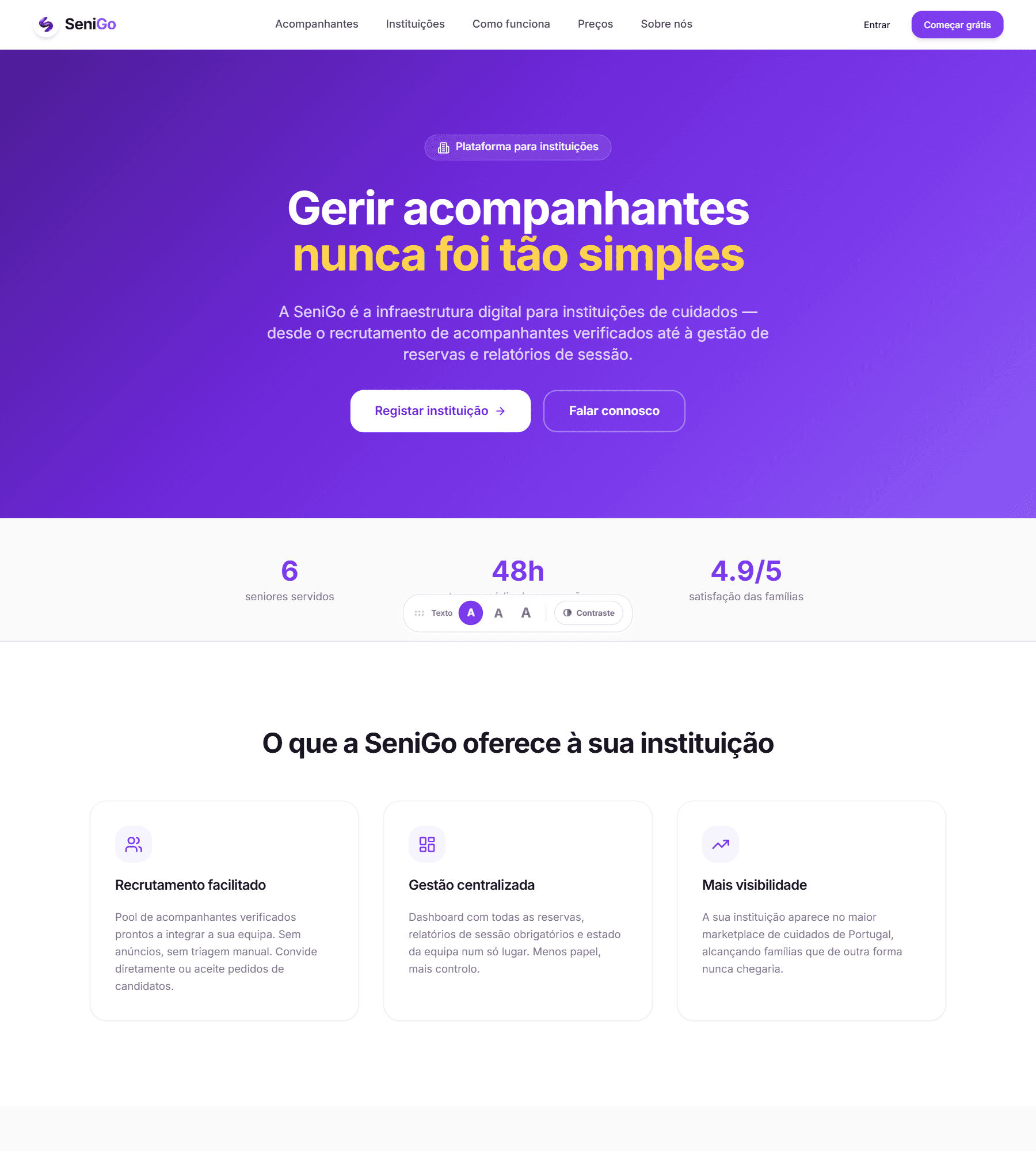
Institutions landing page with register and contact calls to action and the offer to institutions
The institution landing page — supply acquisition is a B2B sale, so it gets its own front door.The figures on this page — seniors served, response time, family satisfaction — are placeholders in the build. There are no users and no measured satisfaction.
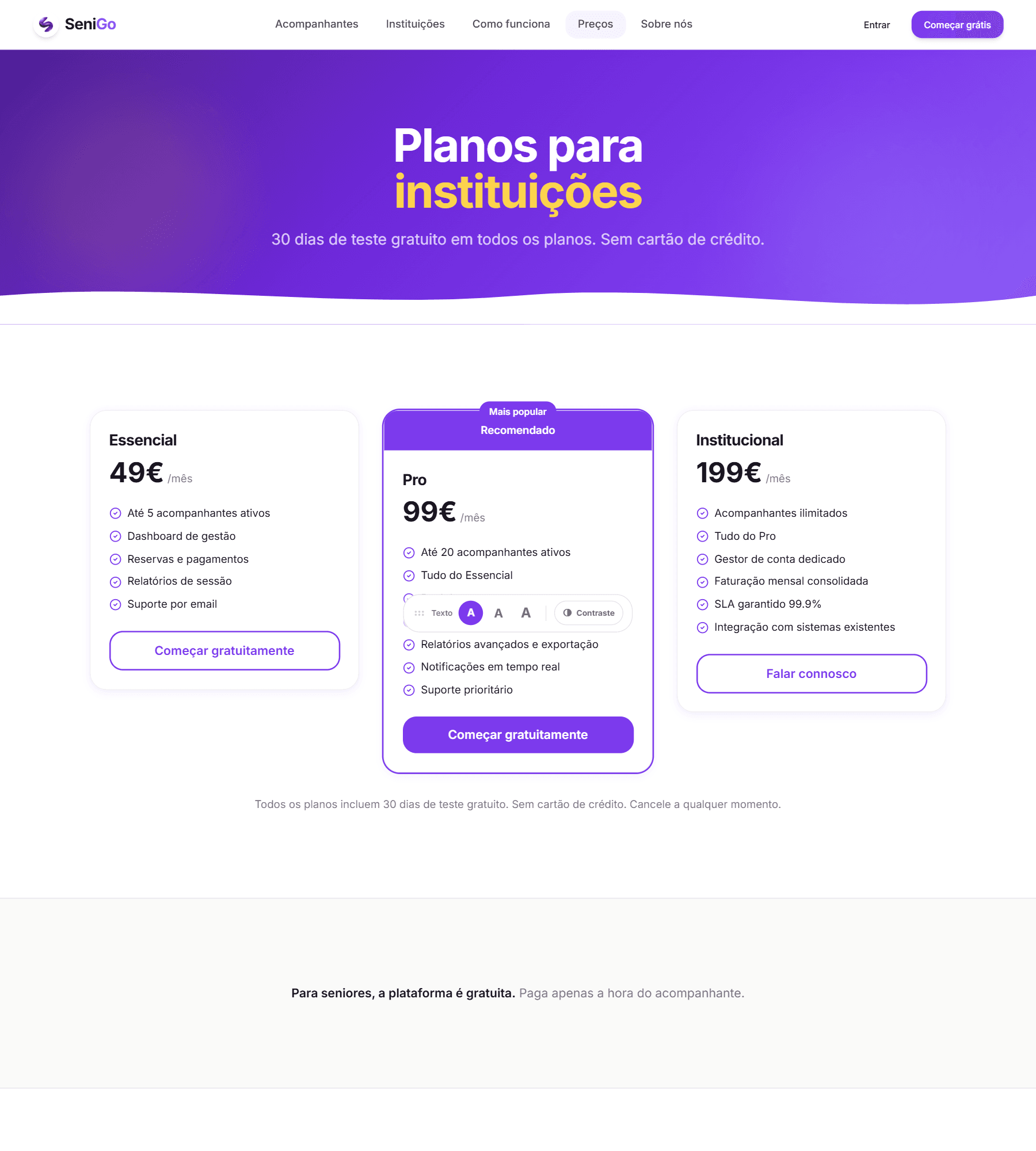
Pricing page with three institution plans and a note that the platform is free for seniors
Three institution plans, and the platform free for the senior.These tiers are presented as available but are not built. This is the credibility risk named in What I would improve.

Trust and retention

Trust is built before signup through the public safety page, public profiles and real reviews, and reinforced at every transaction through escrow, session reports and a real dispute process.

Retention levers that exist today: favourites, review history, recurring bookings, receipts, and the notification system. The session report is quietly one of the strongest — a family that has accumulated a written history of care has something the platform holds and a private arrangement does not.

The honest risk remains disintermediation. Once trust exists between two people, the platform has to keep earning its cut.

Funnel and metrics I would instrument

Demand side: profile views → booking requests → acceptance rate → payment completion → service completion → review rate → repeat booking within 60 days.

Supply side: signup → documents submitted → verification pass rate → training pass rate → payment onboarding completion → first accepted booking → time to first earning (the number that most predicts whether a companion stays).

Marketplace health: time from request to acceptance; coverage by city and service type; ratio of active companions to active seniors; dispute rate; and auto-confirmation rate — if a high share of bookings close automatically rather than being confirmed, that is a usability problem in operational clothing.

North star candidate: completed and confirmed bookings per month. It only moves when both sides got what they needed.

None of these currently have values.

(13)SeniGo

Accessibility & trust

For this audience, accessibility and trust are not two workstreams. A product that is hard to read is also a product that is hard to believe.

Legibility

A 17px base rather than 16, three user-selectable sizes up to 23px applied at the root so the whole interface scales together, a true high-contrast mode that rewrites colour tokens rather than filtering the page, and font smoothing disabled in that mode because anti-aliasing thins letter strokes for exactly the people who enabled it.

Simplicity

One primary action per screen. Status expressed as a word, not a colour. Forms that ask for the minimum at each stage and defer the rest. Choices offered as options to recognise rather than fields to compose.

Navigation

Role-adaptive navigation, so nobody has to look past half a product that was not built for them. A consistent card anatomy across sections so a pattern learned once transfers. A six-step guided introduction for seniors rather than tooltips, because hover is not a gesture that exists on touch and is not a habit that can be assumed.

Language

Plain Portuguese throughout, with no platform jargon. "Waiting for confirmation" rather than a status code. No provider, no listing, no gig. The word acompanhante — companion — was chosen deliberately: it already carries the right meaning in Portuguese, describing a person rather than a service unit.

Trust

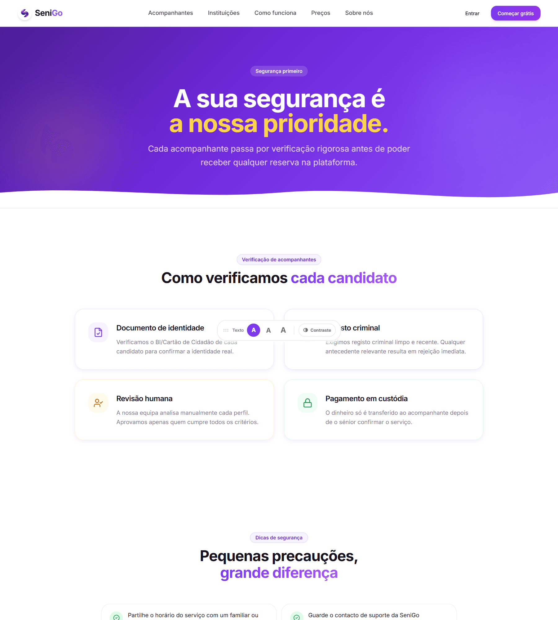
Verification shown, not claimed: a public page setting out the chain step by step — identity document, criminal record, human review, escrowed payment. A verified badge and an institution name on every profile. Ratings with plain-language equivalents. Companion replies to reviews, which show accountability rather than just reputation.

Safety page setting out identity document, criminal record, human review and escrowed payment
The verification chain given its own page, step by step, rather than buried in an FAQ.

Safety

Identity documents front and back, criminal record, a selfie holding the document, tax number, and human review of all of it. Emergency contact, mobility needs and medical notes held on the senior's profile so the companion arrives informed rather than guessing. Funds held until the service is confirmed. An audit log behind the scenes, and a full history export for the law-enforcement requests a platform like this will eventually receive.

Transparency and reversibility

Full price breakdown before any commitment. Receipts afterwards. Visible status at every stage of a booking. A stated 24-hour free cancellation window rather than a policy discovered at the moment of cancelling. A real dispute route with a human at the end of it.

The rule I held throughout:

Every step a senior takes should be either reversible, or clearly explained before it is taken.
(14)SeniGo

What I learned

Trust is a flow, not a badge

I began thinking about trust as something to display — a verified marker, good reviews, a reassuring safety page. I ended up understanding it as something a product does, distributed across the whole journey: what it asks for and when, what it holds back, who has to agree before money moves, and what happens when someone says it went wrong. The badge is the smallest part of it.

Friction in the right place is a feature

Every instinct I had said reduce steps. This project taught me to ask whose steps, and what the steps signal. The three gates a companion passes through make the product slower to join and materially safer to use — and the friction on the supply side is precisely what lets the demand side stay short.

Designing for older adults produced a better product for everyone

Larger base type, one clear action per screen, status as words, plain language, reversible steps. None of that is worse for a thirty-year-old. Designing for the harder case raised the floor everywhere, which is an argument I would now make on any product.

Building it taught me what my design decisions cost

Escrow is not a toggle. It is a payment record, a webhook, a state machine, a scheduled job, a dispute process and an admin interface. Knowing that changes how I design — not by making me more timid, but by making me able to say which part of a proposal is expensive and why, which is what makes a designer useful in a planning conversation rather than just in a review.

The user and the buyer are not always the same person

The clearest gap I found was in my own thinking, not in the interface: the adult child who searches, evaluates and pays is not modelled anywhere in the product, even though they are probably the most active user it has. I found that by reasoning about the journey rather than the screens, which is an argument for doing that first.

A category gets judged before the product does

One acceleration programme turned the application down at a stage where, as far as I could tell, only the theme had been read — not the idea, and not the product.

The useful response is not to argue with it. It is to take it literally: elder care reads, at a glance, as a low-growth social-sector category. If that is the impression the theme alone creates, then positioning has to do real work before anyone ever reaches the product — leading with the institutional model, the escrowed transaction and the B2B2C economics rather than with the demographic.

That is a communication problem, and it is mine rather than the reader's. It changed how I open when I describe this product, including in this document.

Writing down which assumption a decision rests on

The pivot from marketplace to institution-backed network was only possible because I had written the trust assumption down explicitly. When the logic of individual verification failed, it was obvious what had failed and what would need to replace it. Decisions held loosely in your head cannot be revisited, only defended.

Turning a problem into a product

The problem statement survived the entire project intact. Almost every solution I put around it changed. That is the right way round, and the main thing I would want to carry into the next project.

(15)SeniGo

What I would improve

1 · Research is the biggest gap, and it is not close

No interviews, no usability testing, no sessions with real older adults. Everything this case study says about senior usability is reasoned rather than observed. First action: 5–8 moderated sessions with adults aged 70+, on their own devices, attempting the discovery → booking flow unassisted. I would expect it to invalidate several decisions I currently think are good, and that is worth more than confirmation.

2 · The family member is not modelled

No way for an adult child to hold an account, manage a parent's bookings, or receive notifications. Given that they are probably the most active user of a product like this, it is the highest-value missing feature and the clearest blind spot in my own process.

3 · Search cannot answer the real question

Filtering works on city as text, not distance or radius. Weekly availability exists in the data model but cannot be filtered on. The actual query a person has is "who can help me on Thursday afternoon, near me" — and right now the product cannot be asked it.

4 · The cold start for new companions is unsolved

Zero reviews means no bookings means zero reviews. A verified but empty profile competes against established ones and loses every time. This needs a deliberate mechanism — institutional vouching surfaced more strongly, introductory pricing, a clearly explained new state that shows verification in place of history, or a first-booking guarantee.

5 · Accessibility needs verification, not intention

No screen-reader testing, no formal WCAG audit, no testing with assistive technology, and no testing with users who actually rely on the high-contrast mode. The system was built carefully, but careful is not the same as verified, and I would not claim compliance without an audit.

6 · Trust signals are one-directional

Seniors evaluate companions in depth. Companions know almost nothing about who they are going to meet or what they are walking into. That is a safety gap on the supply side, and it is the kind of asymmetry that looks fine until an incident makes it obvious.

7 · The build has not caught up with the core decision

The product decision is that a companion reaches the platform through an institution. The data model still treats that affiliation as optional, and the onboarding flow does not ask for it — a companion can currently be approved and start taking bookings with no institution behind them.

That is the gap between a decision made on paper and a decision enforced in software, and it is the most important thing on this list to close, because the entire trust argument rests on it.

8 · Verification does not scale as built

Every document set is reviewed manually. At any real volume that is either a bottleneck that starves supply or a process that gets rushed — and rushed verification is worse than none, because it is trusted. It needs triage tooling, risk scoring, and a clear escalation path.

9 · Notifications assume habits this audience may not have

Email and in-app only. An older adult may not check email daily. For time-critical events — booking accepted, companion on the way, service tomorrow — SMS or a phone fallback is probably not optional.

10 · The pricing page promises something that does not exist

Institution subscription tiers are presented as available. That is a credibility risk with exactly the partner segment the strategy depends on, and it should either be built or reframed as coming soon.

11 · The cancellation policy is too blunt

A single 24-hour cutoff, free before and impossible after. Real care needs are unpredictable on both sides. A graduated policy — partial fees, a late-cancellation allowance, different rules for illness — would be fairer and would reduce support load.

12 · Nothing is instrumented

No analytics, so none of the metrics in the business section could currently be answered. Before any growth work, the funnel needs to be measurable — starting with completion rates on the two onboarding flows, which is where I would expect the largest silent losses.